More Is More
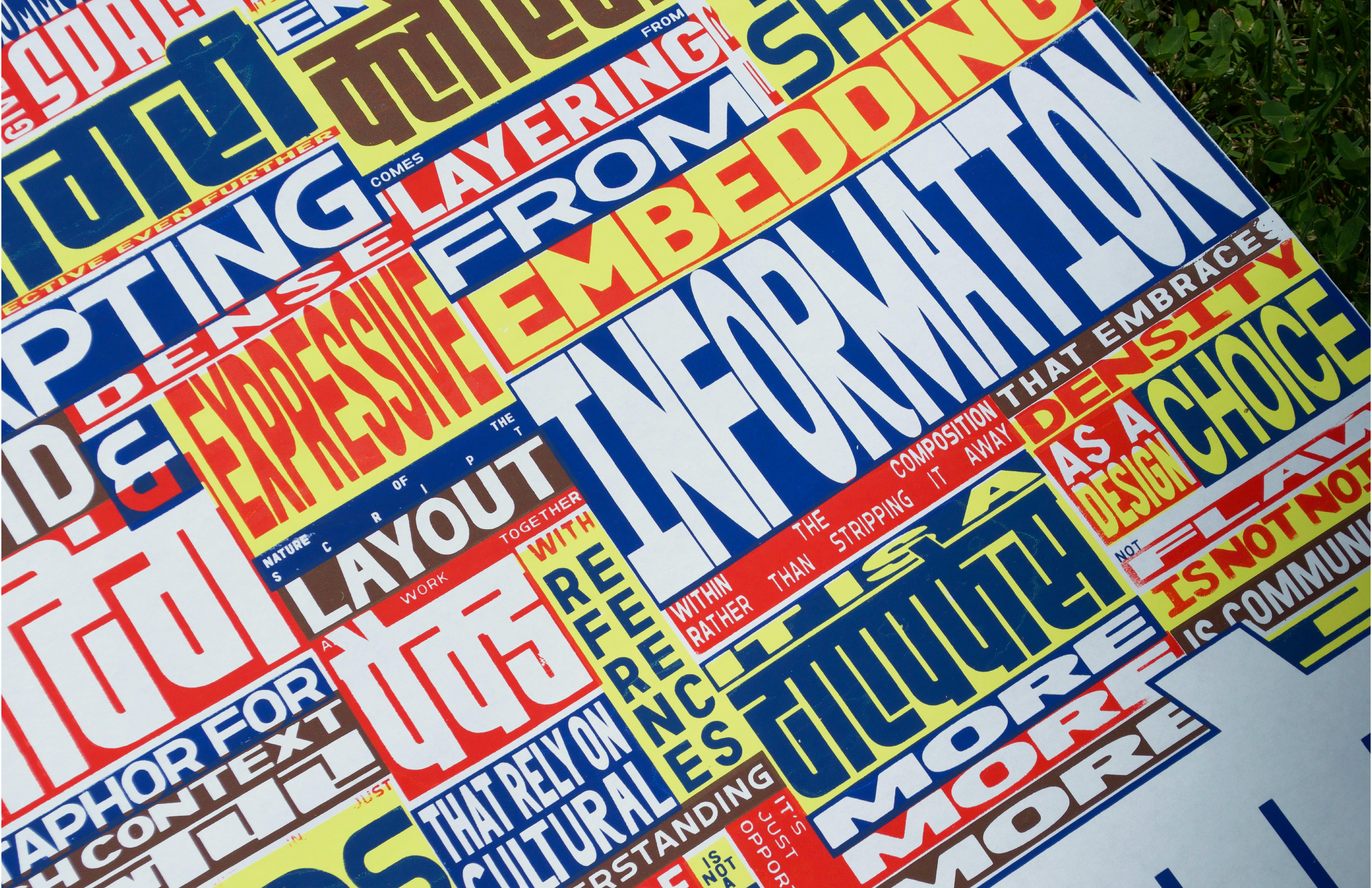
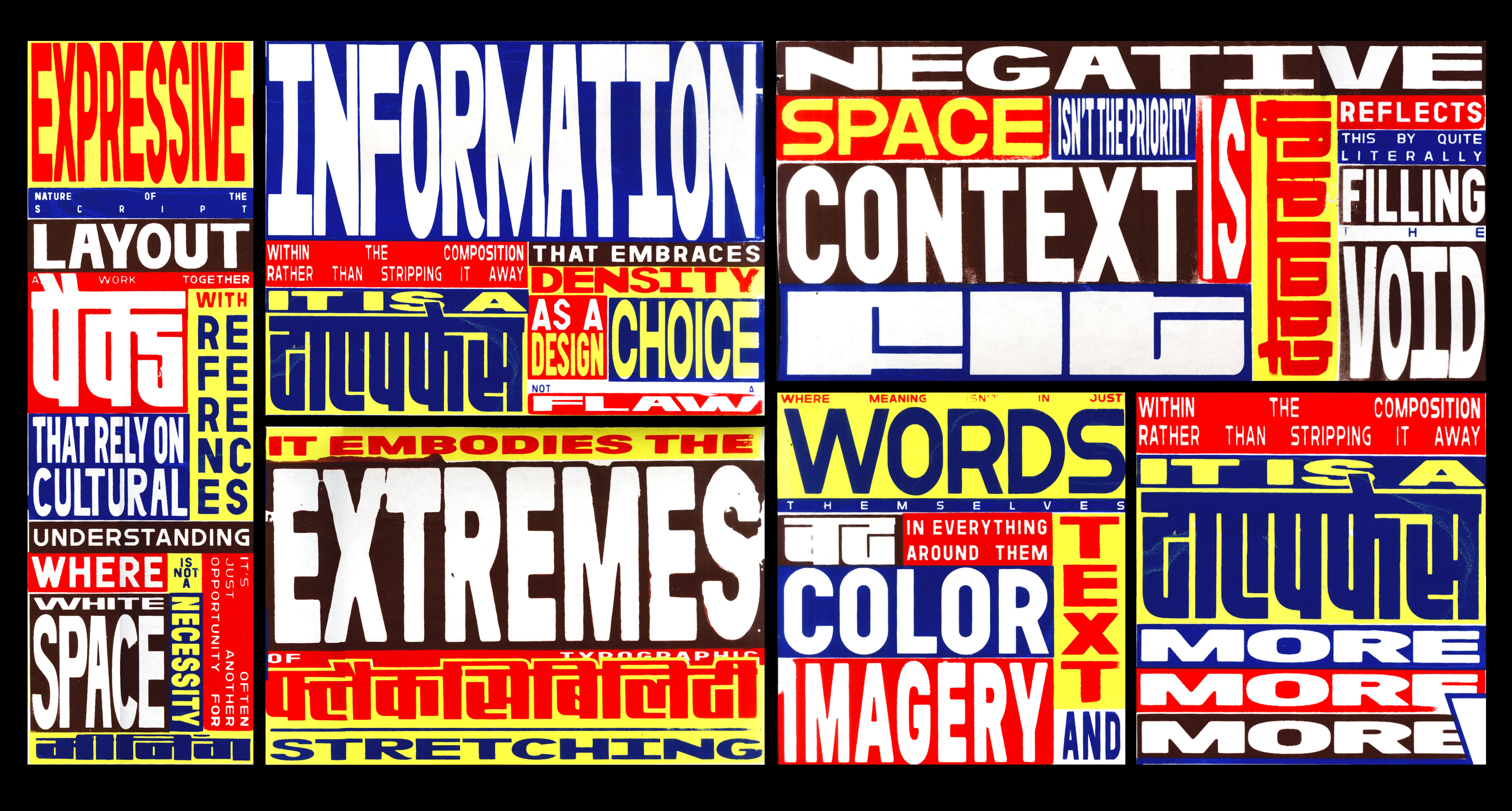
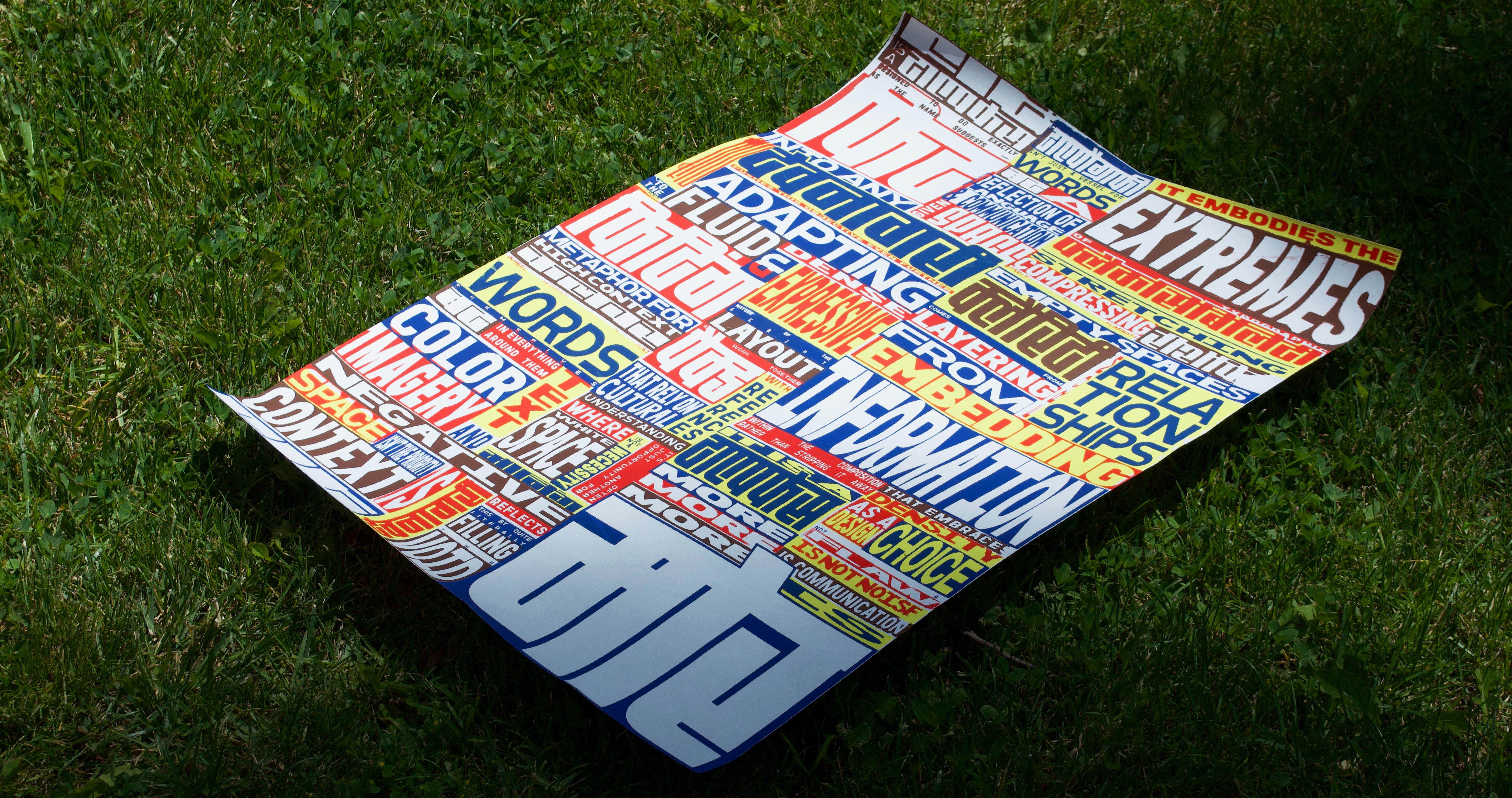
A four-layer screen-printed poster for the typeface Fit Devanagari, reflecting the compositional traits of visual communication in high-context cultures.
Fit Devanagari, a typeface that expands to fill space, mirrors this cultural logic. It fits—not just formally, but conceptually. The poster challenges Western ideals of white space and minimalist design by celebrating a "more is more" sensibility.
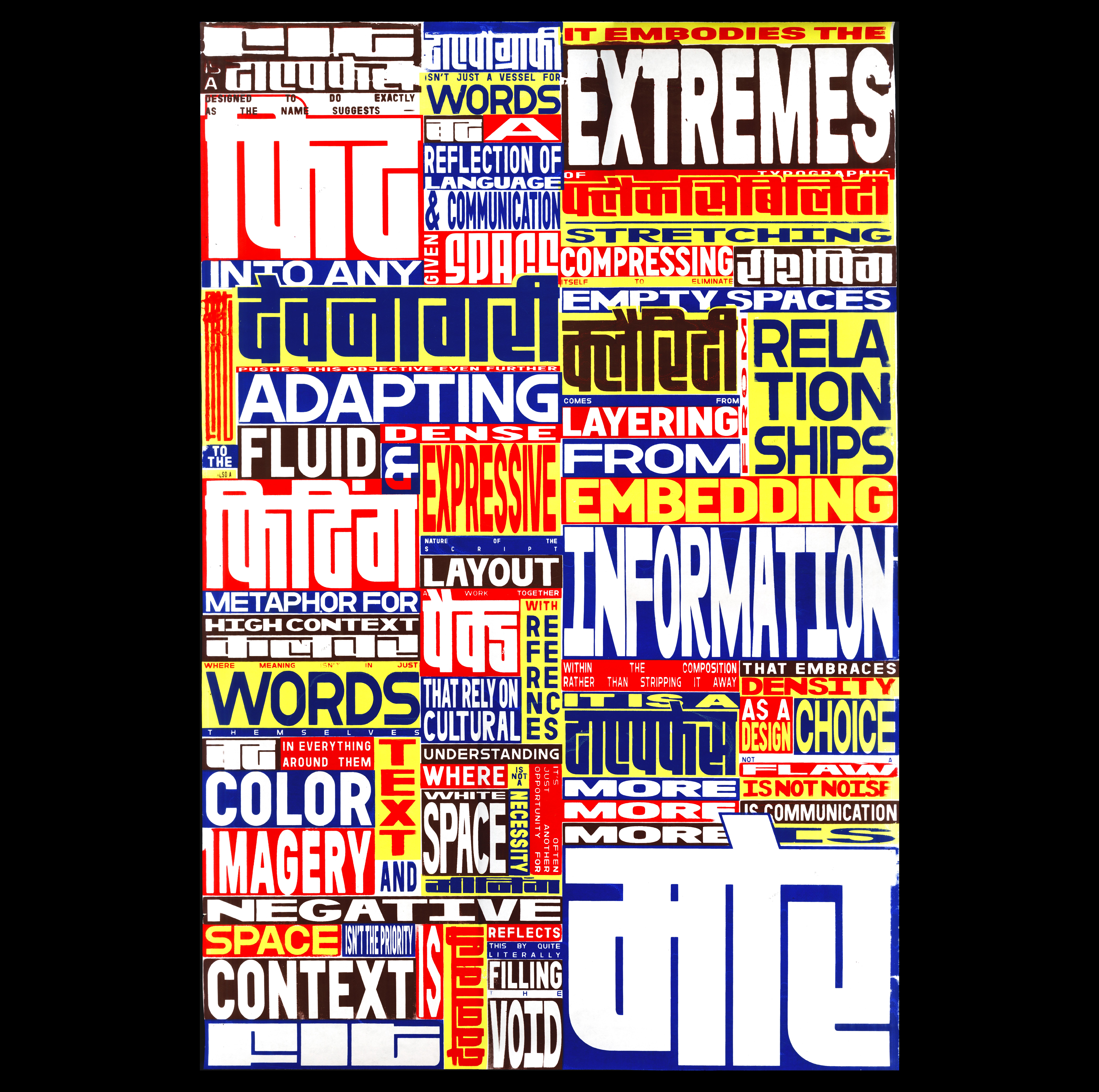
This poster draws from the visual world of Indian coaching class flyers—something I’ve grown up seeing plastered across walls and poles back home. I was interested in their density, urgency, and unpolished charm.
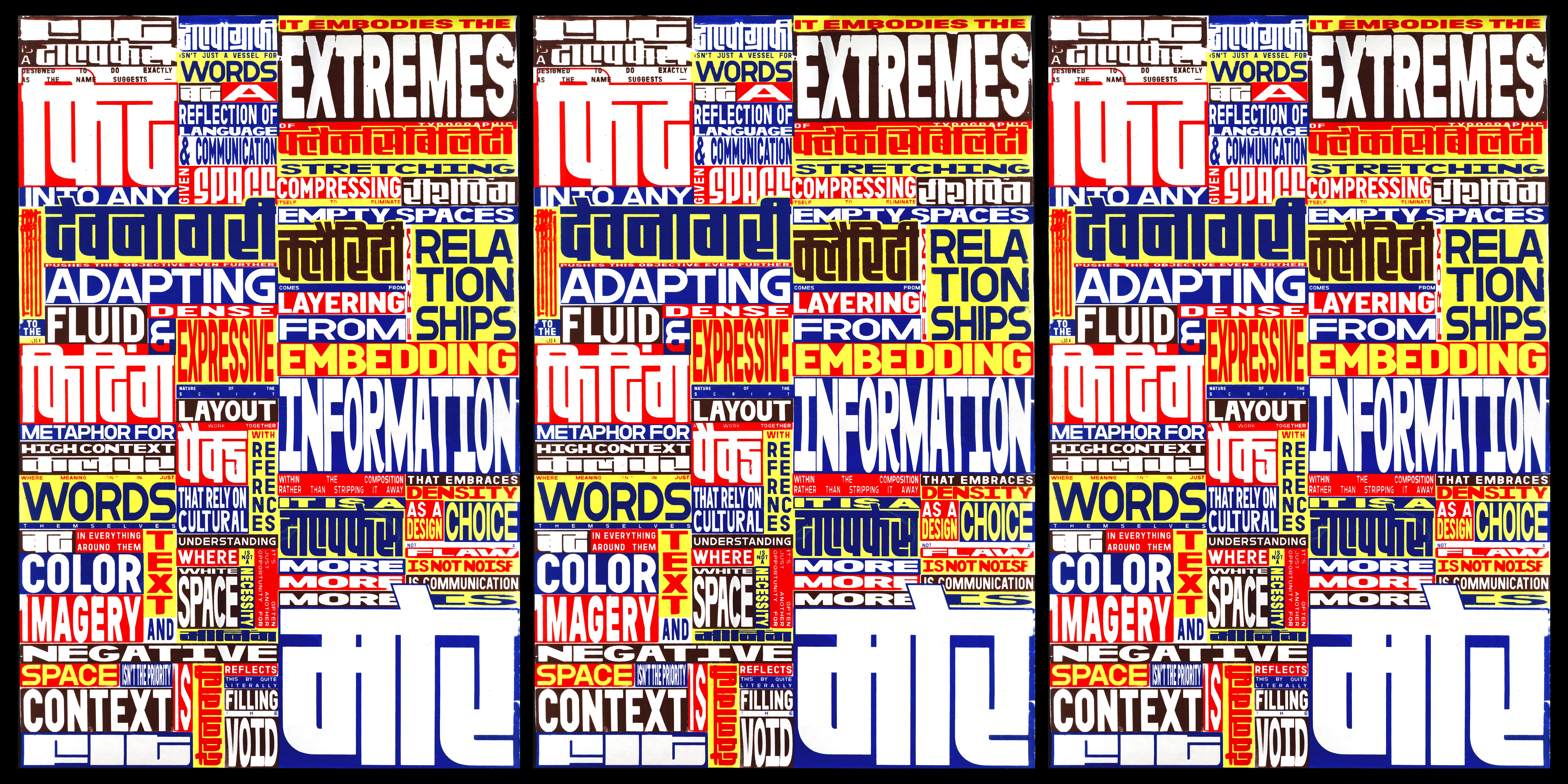
To echo that feeling, I printed on thin, fragile paper that mimics their low-cost production. The text is a personal reflection on the Fit Devanagari typeface, with some words translated phonetically into Hindi—a way of letting both languages sit side by side, just like they often do in the spaces I come from.
