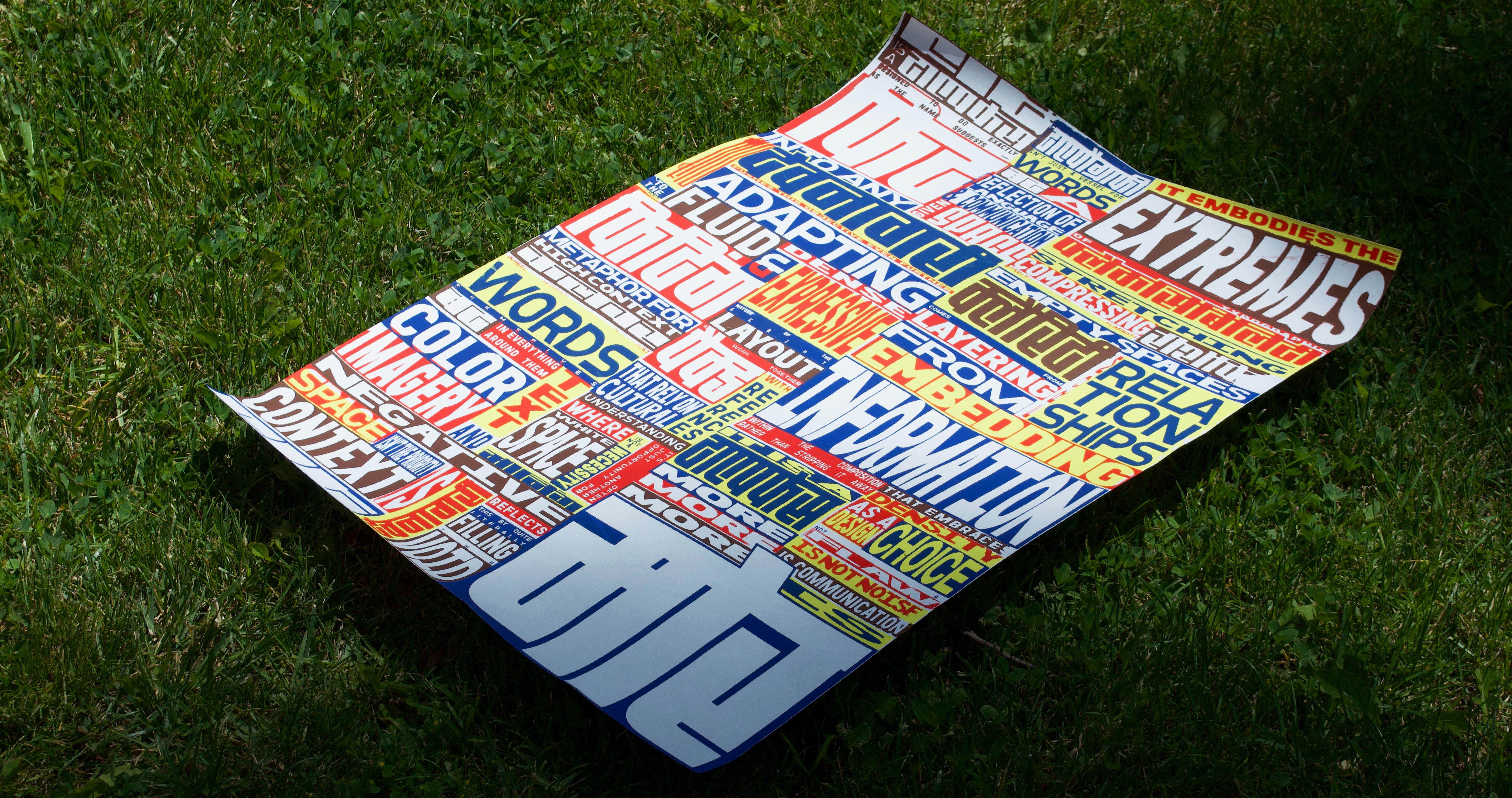
More Is More
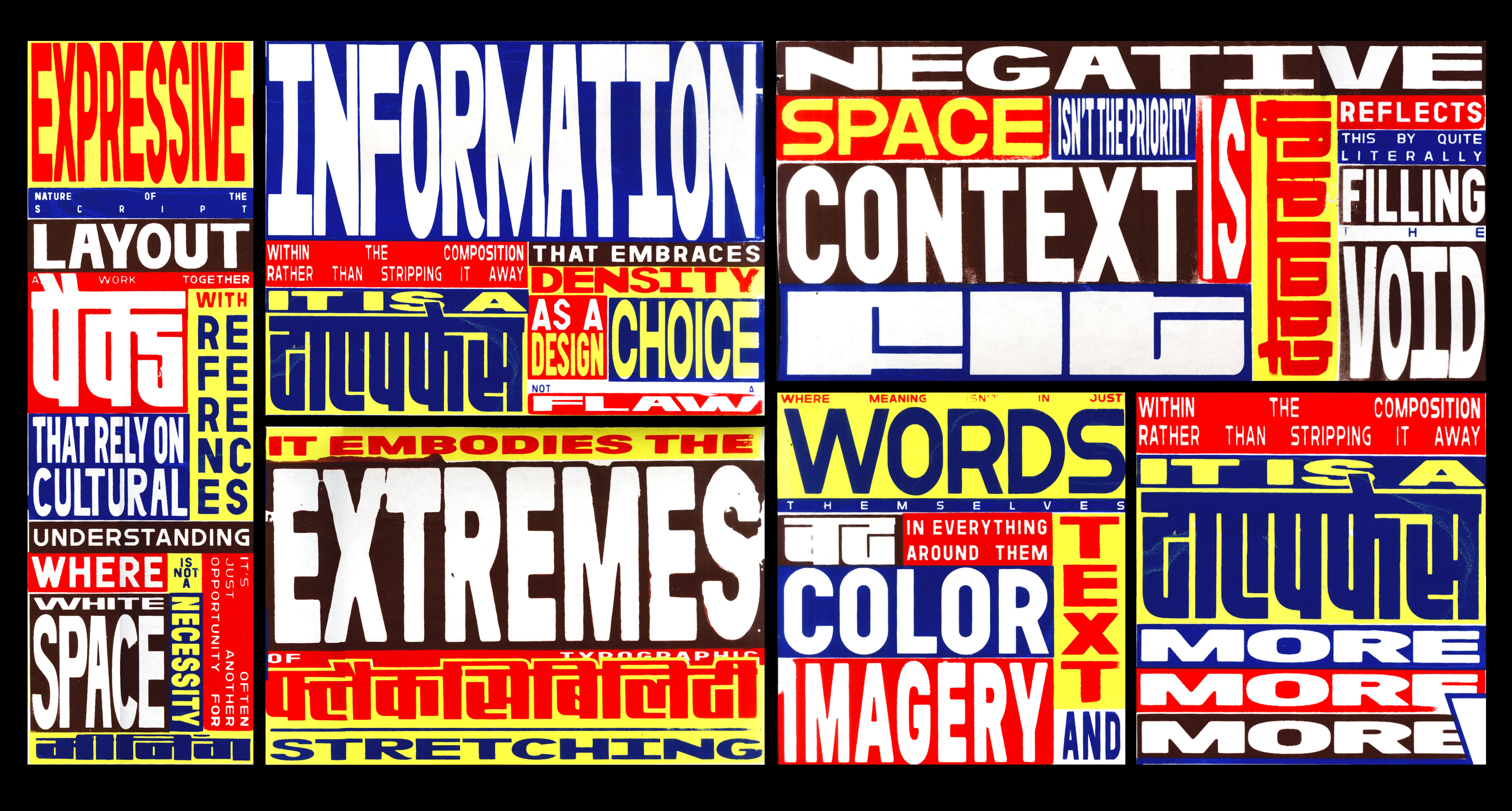
A four-layer screen-printed poster for the typeface Fit Devanagari, reflecting the compositional traits of visual communication in high-context cultures.
Fit Devanagari, a typeface that expands to fill space, mirrors this cultural logic. It fits—not just formally, but conceptually. The poster challenges Western ideals of white space and minimalist design by celebrating a "more is more" sensibility.
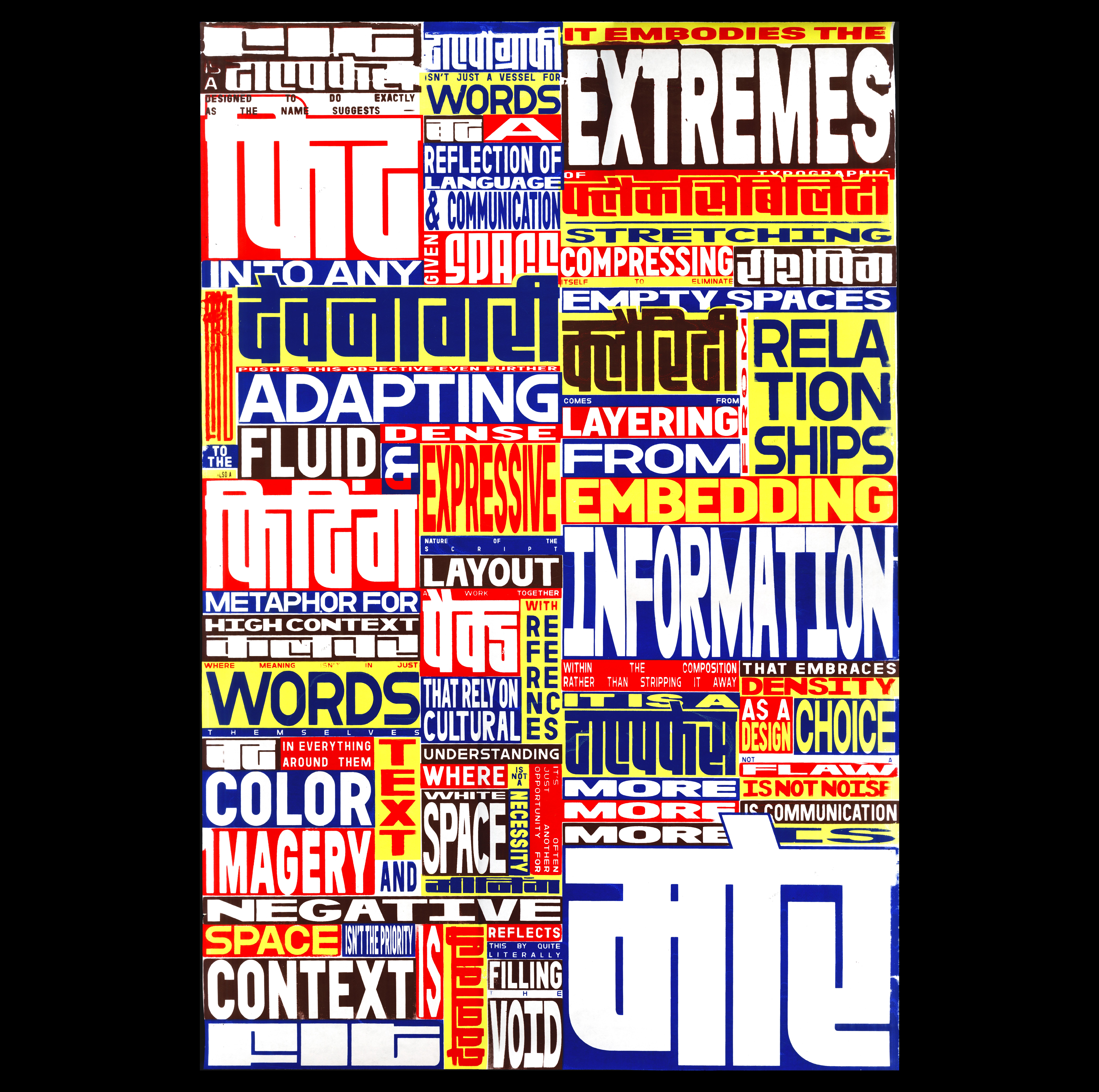
This poster draws from the visual world of Indian coaching class flyers—something I’ve grown up seeing plastered across walls and poles back home. I was interested in their density, urgency, and unpolished charm.
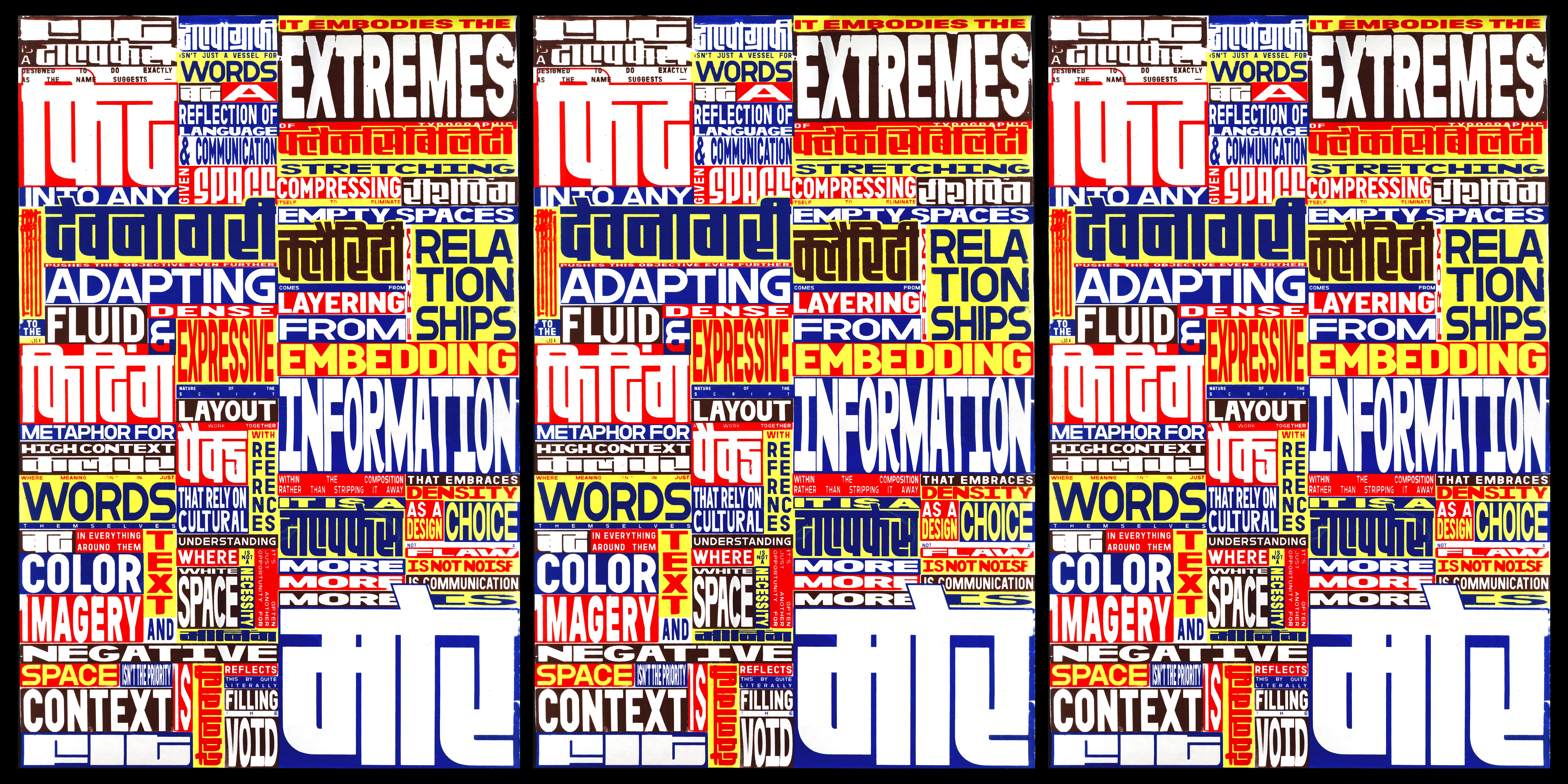
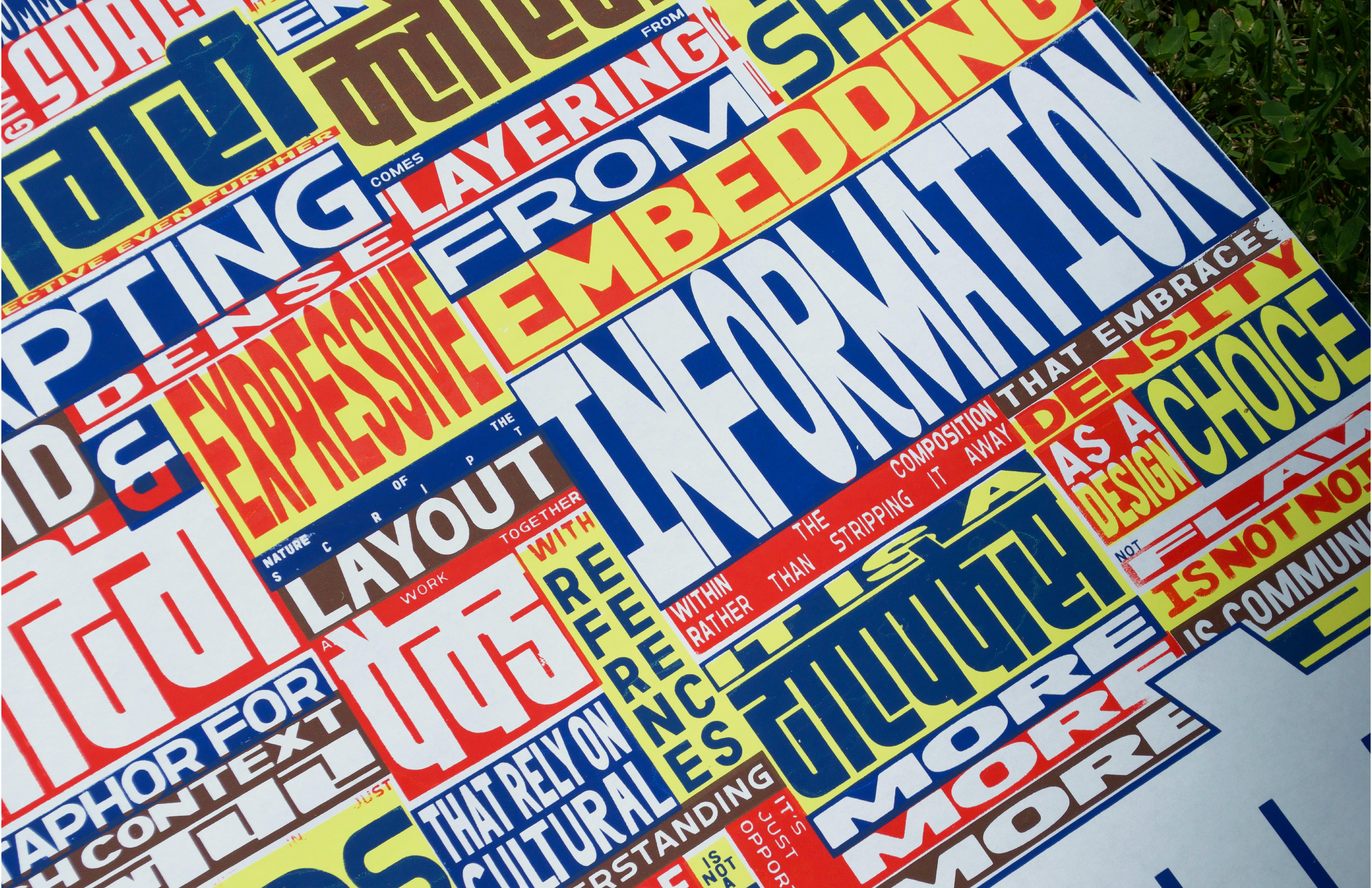
To echo that feeling, I printed on thin, fragile paper that mimics their low-cost production. The text is a personal reflection on the Fit Devanagari typeface, with some words translated phonetically into Hindi—a way of letting both languages sit side by side, just like they often do in the spaces I come from.
Trampoline: Olympics
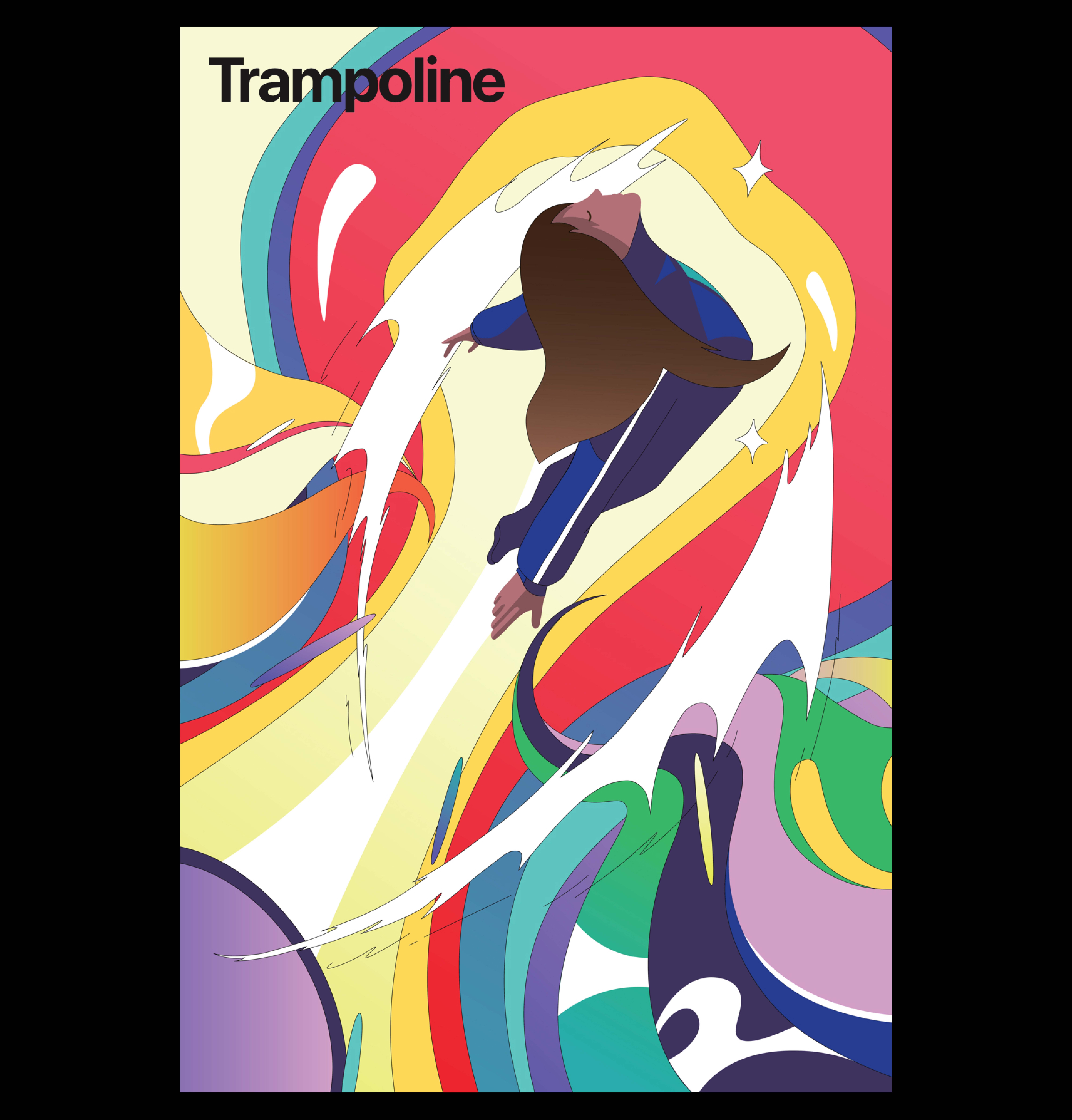
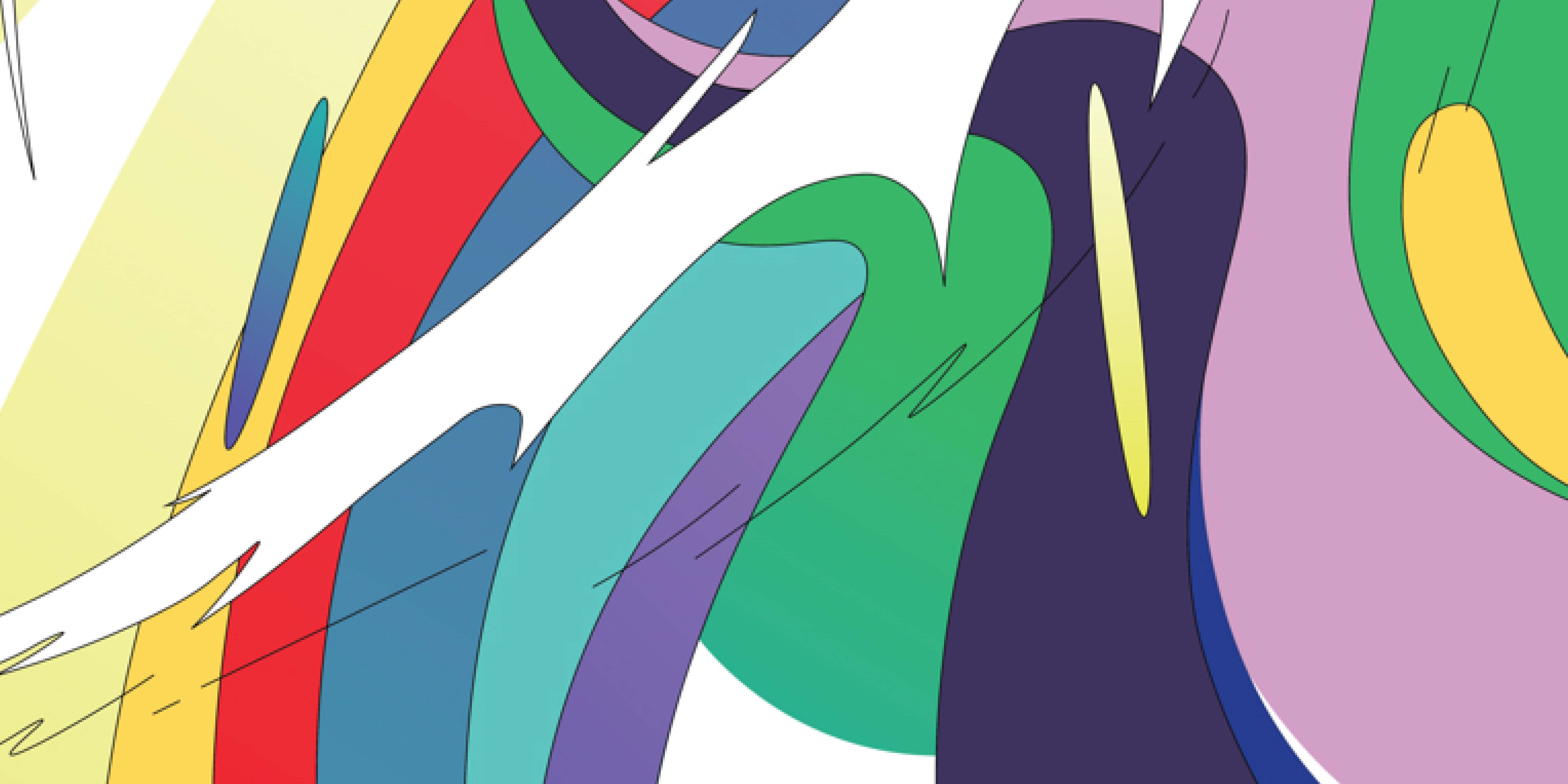
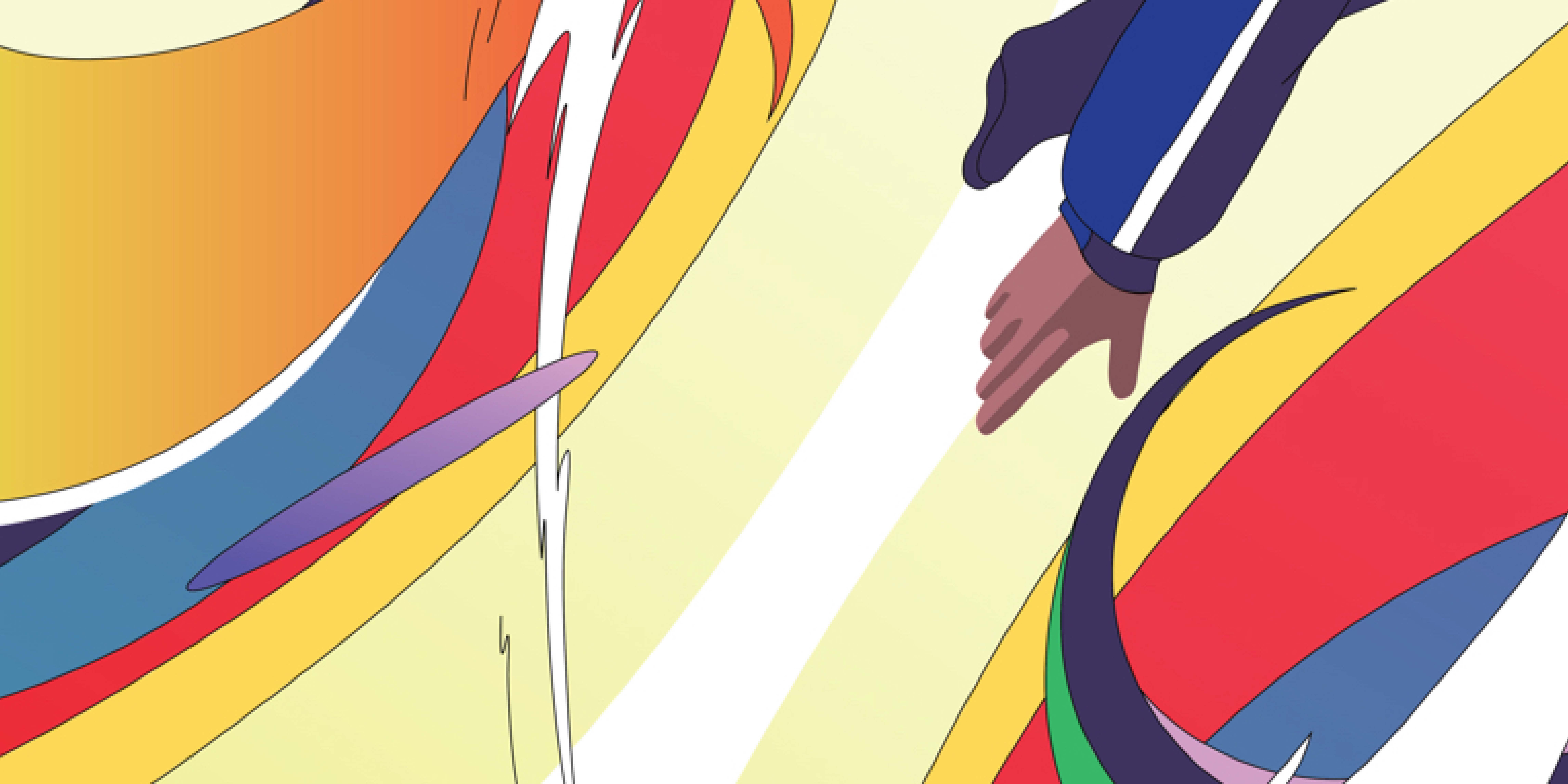
As part of an internal Apple project, I illustrated a 24x26 inch poster for the sport trampoline—one of many sports assigned to different creatives across the company. I wanted to capture the surreal, weightless feeling of being mid-air, suspended in motion.
The final piece leans into exaggerated movement and bold, energetic forms. It was printed and hung in the office alongside the rest of the series.
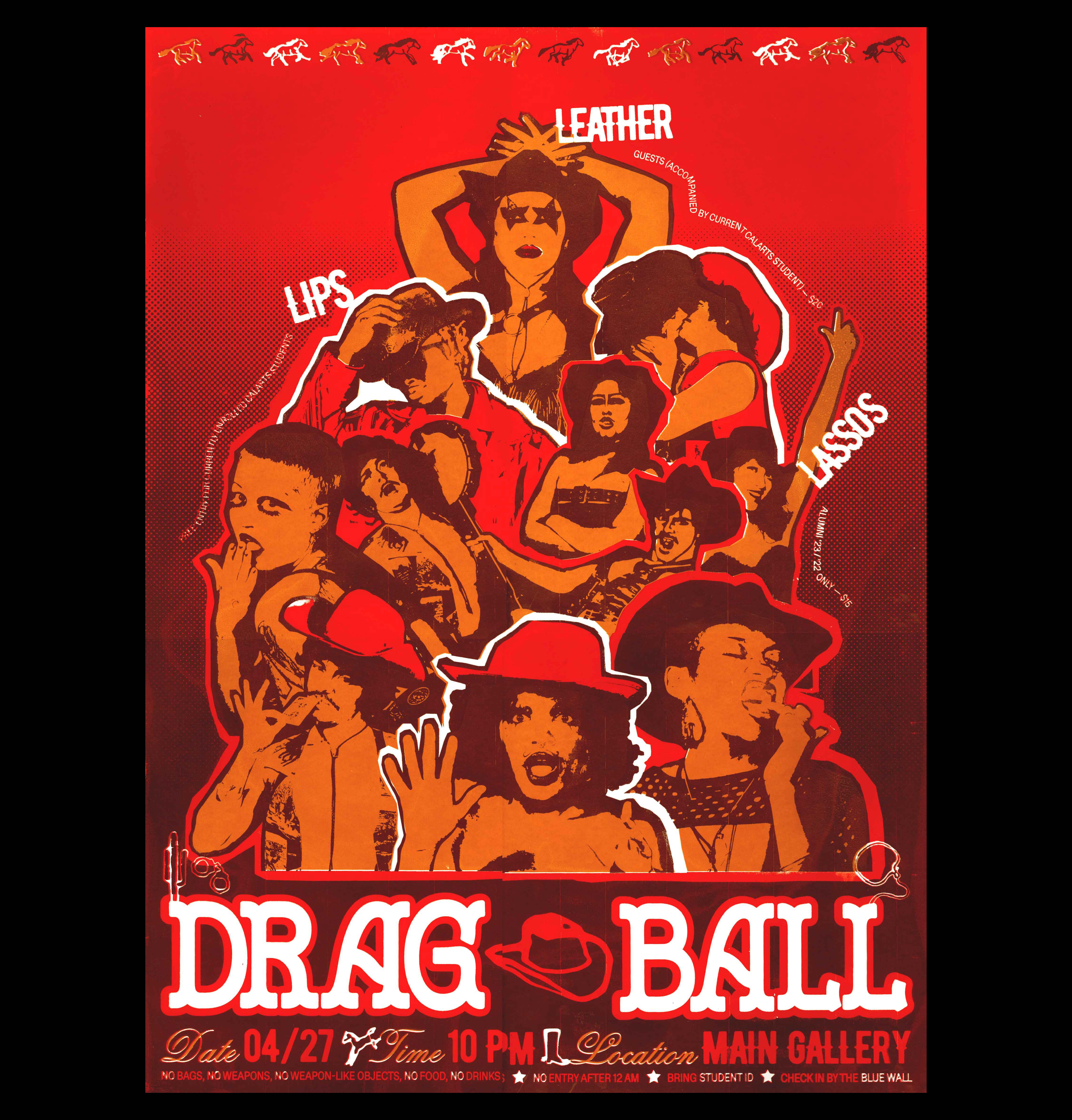
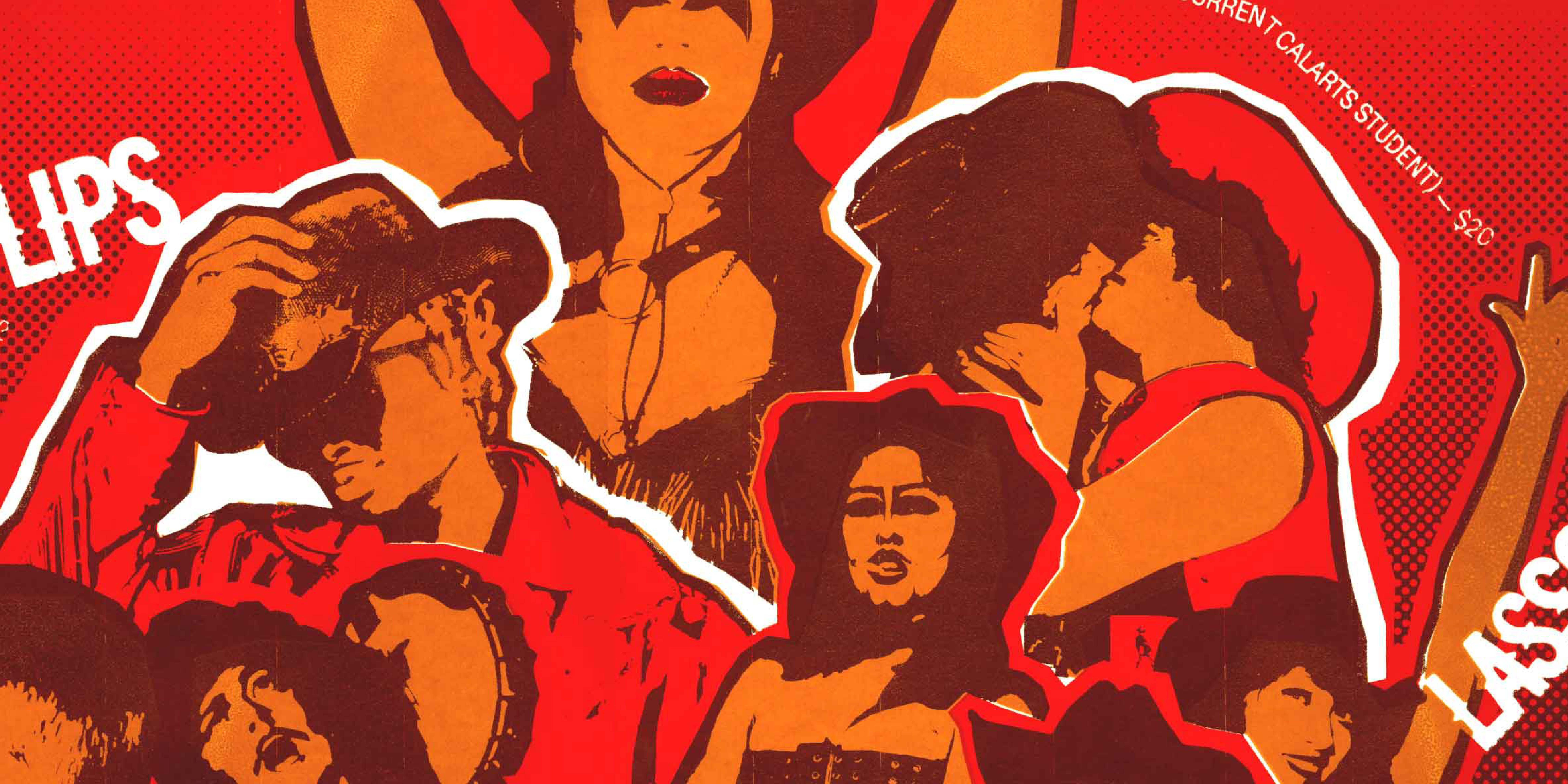
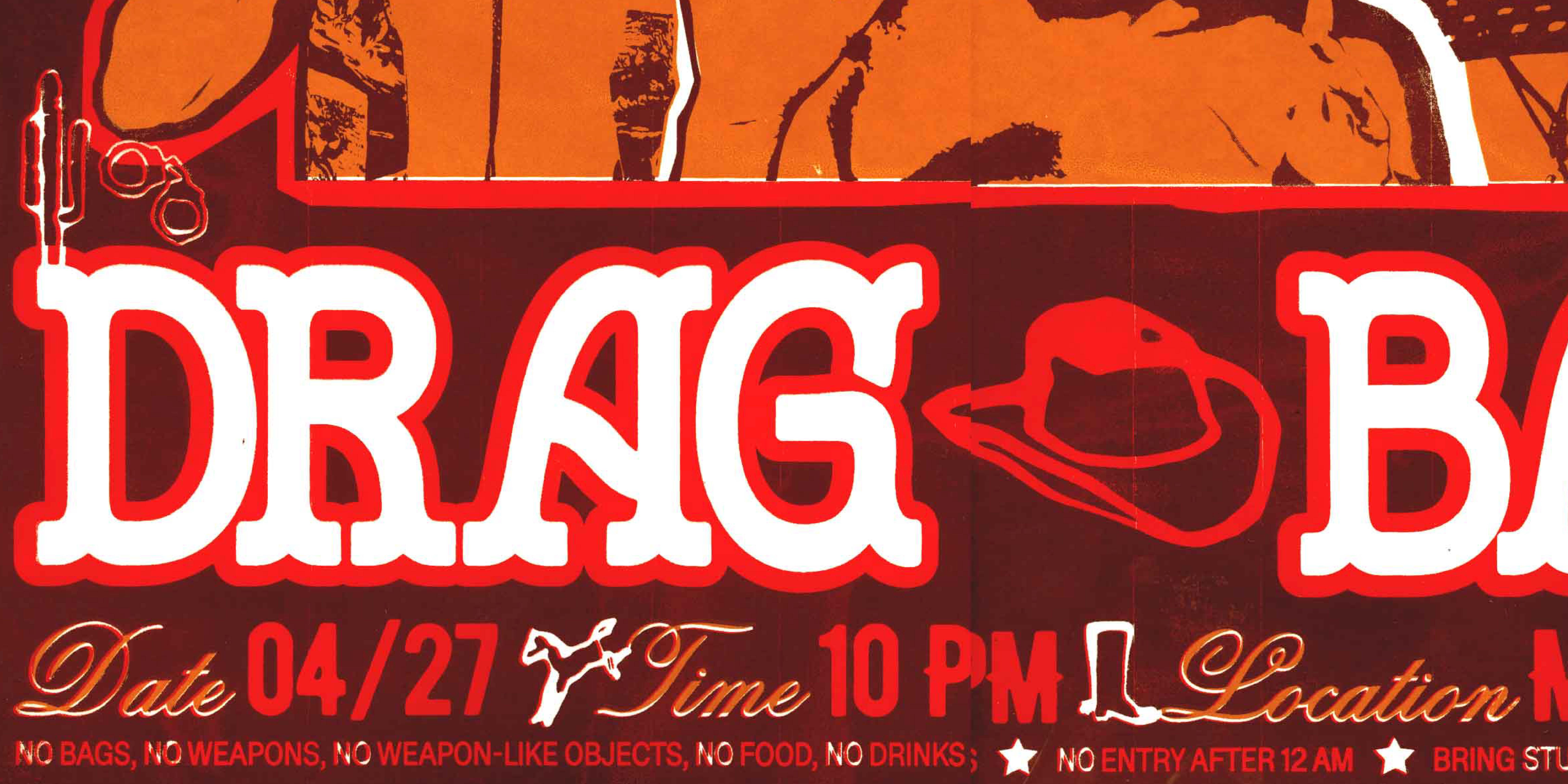
CalArts Drag Ball
Designed for CalArts’ annual Drag Ball, one of the most celebrated student-organized events on campus. The 2024 theme was Wild West, so we leaned into campy western tropes—blending cowboy kitsch with bold type and gritty textures.
The poster was 22x30 inches, screenprinted in three colors and pasted across campus for the event.
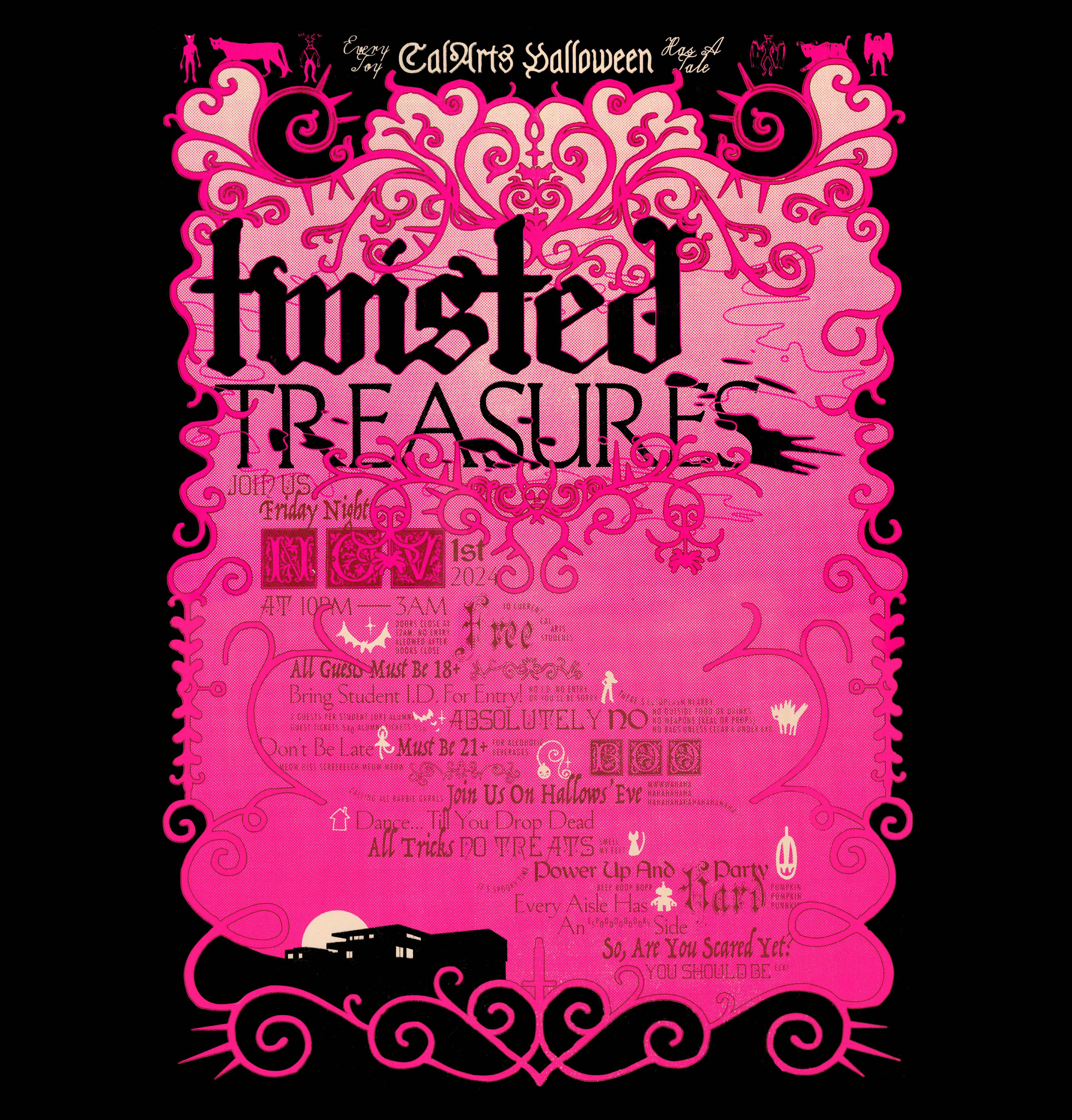
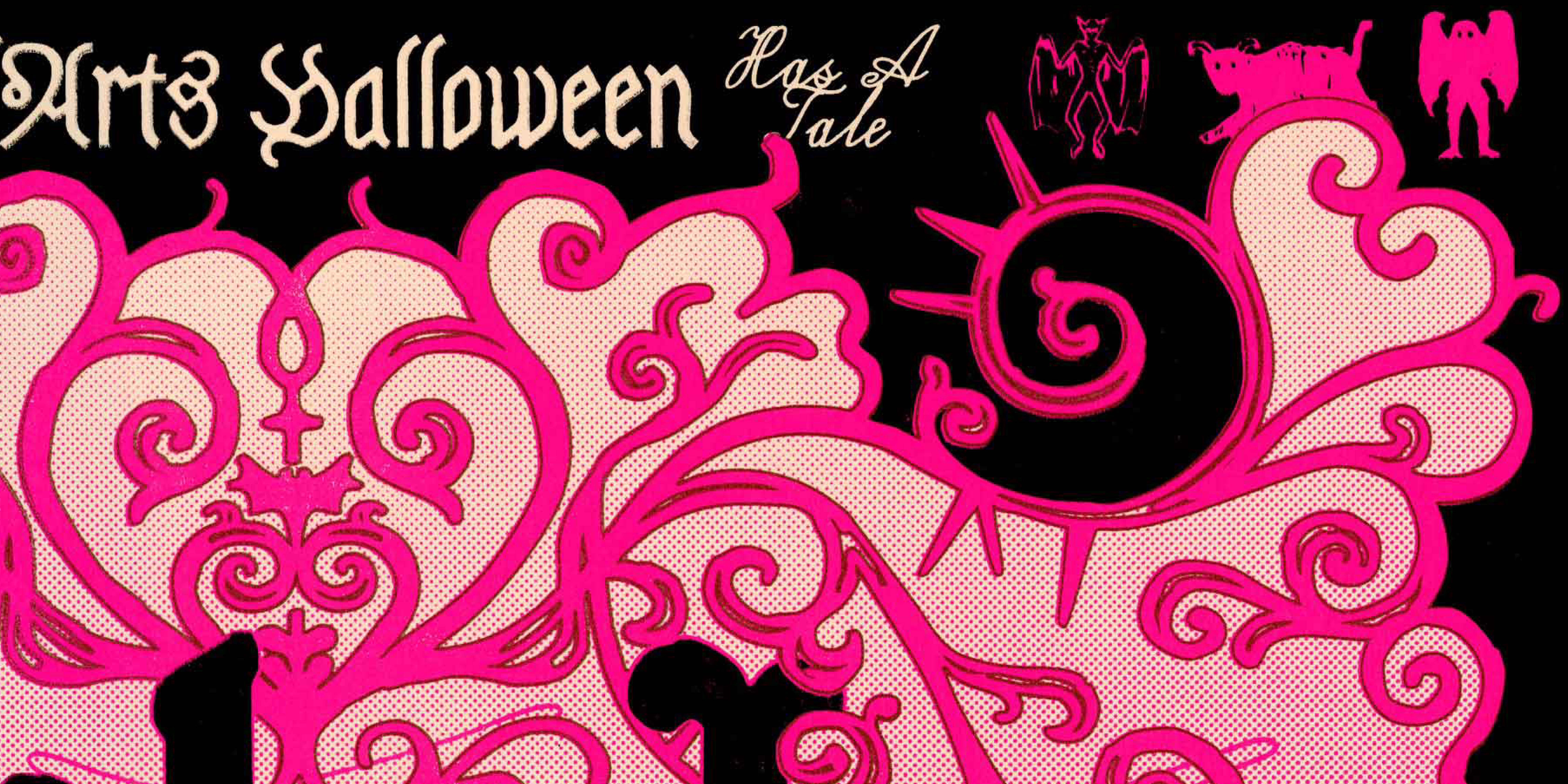
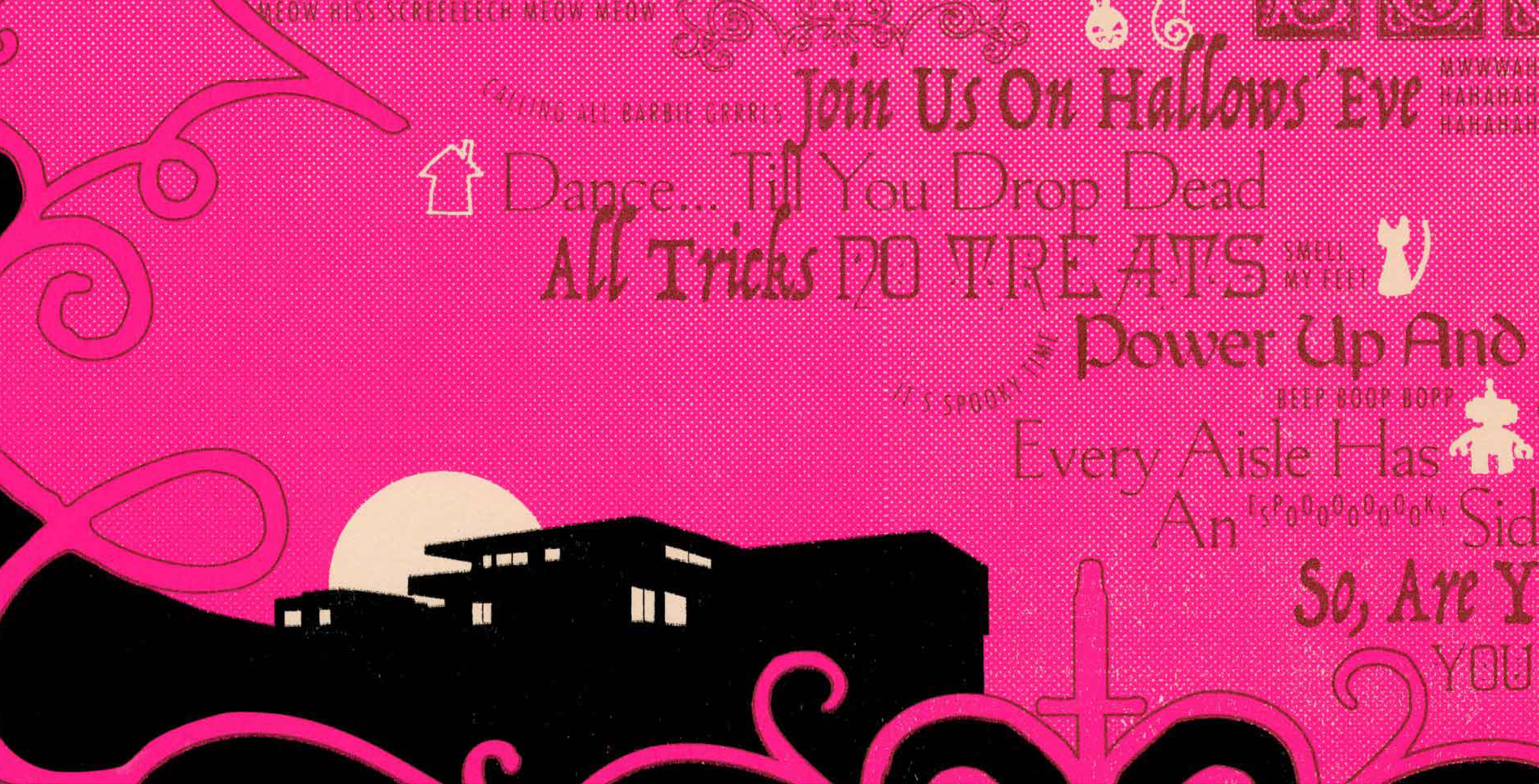
CalArts Halloween: Twisted Treasures
Designed as part of a 5-poster series for CalArts’ annual Halloween party, themed Twisted Treasures. The concept was rooted in eerie toy stores and unsettling nostalgia.
I collaborated with Kari Trail and Maya Alvarado on a bold, type-only poster—one of the more graphic, experimental pieces in the series. The three of us also took the lead on organizing and directing the visual direction for the full set.
Two Lines Align
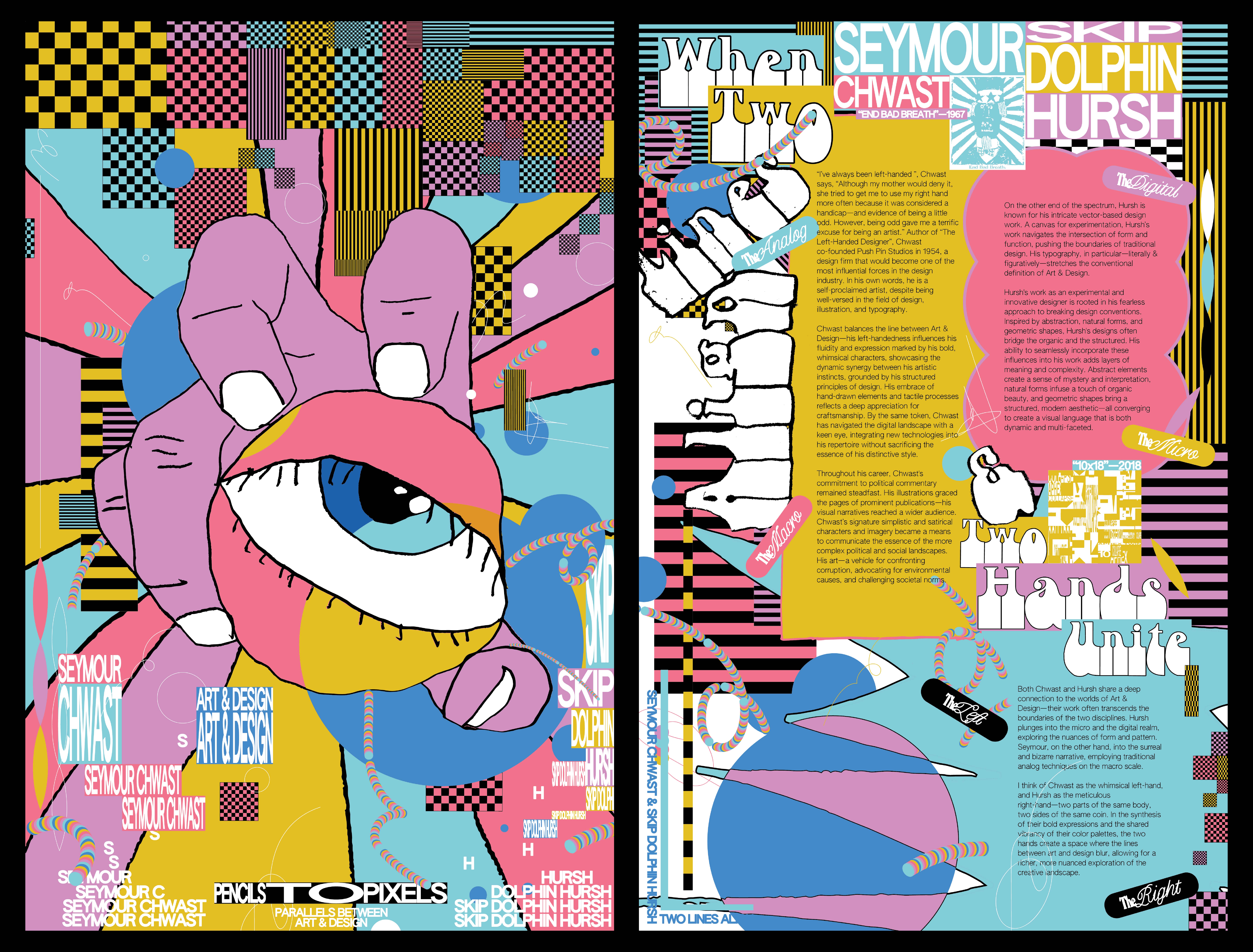
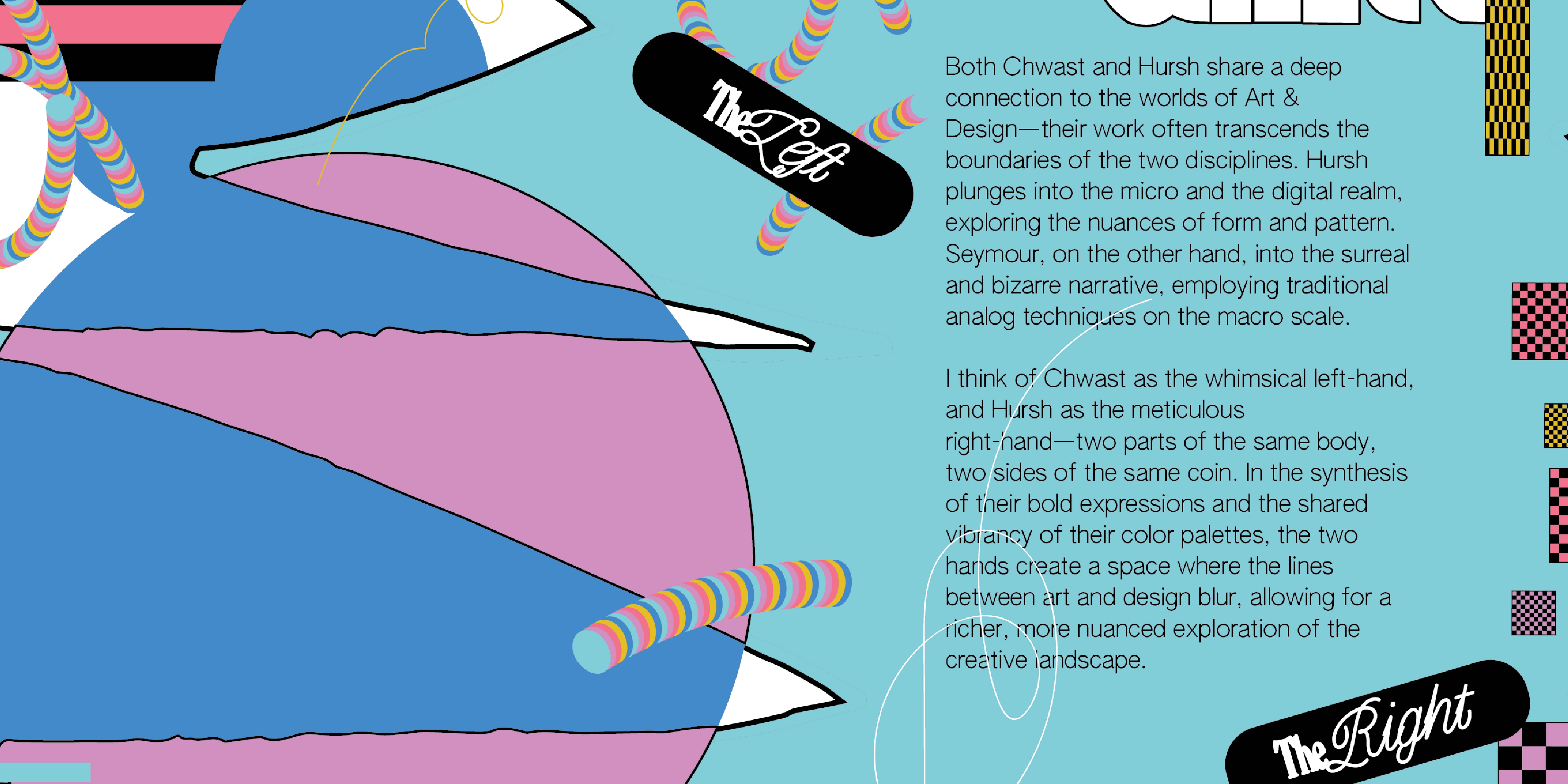
A double-sided poster exploring the contrasts between contemporary designer Skip Dolphin Hursh and historic designer Seymour Chwast. I focused on their approaches to process—digital vs. analog, the micro vs. macro, and even right-handed vs. left-handed ways of making.
Chwast, often called the "left-handed designer" for his playful, whimsical illustrations, inspired me to draw all of his sections with my non-dominant (left) hand.
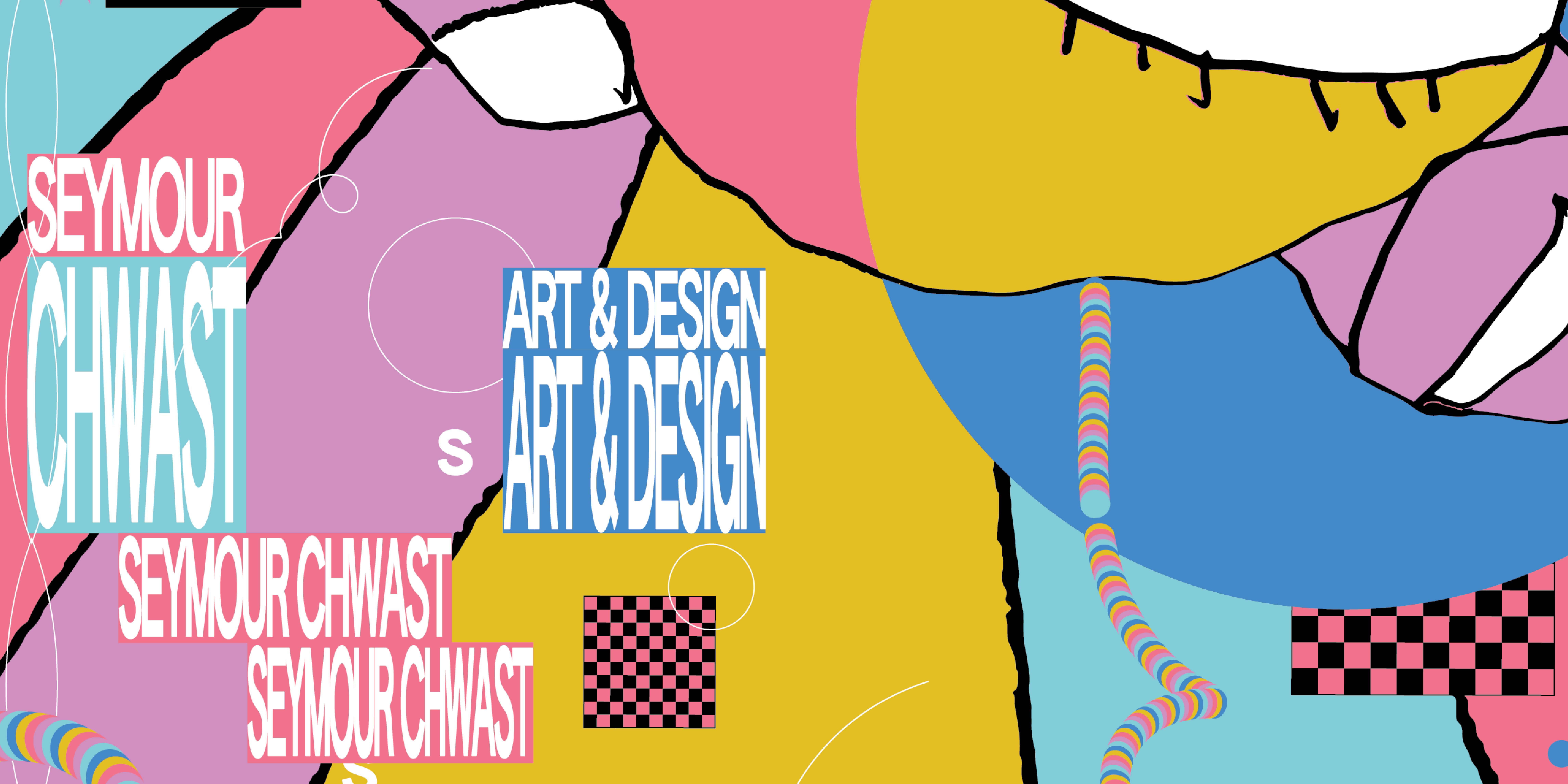
In contrast, I created Hursh’s parts using clean, detailed vector work with my dominant hand. The result is a visual dialogue between two distinct methods of making—personal, tactile imperfection on one side, and digital precision on the other.
REDCAT: Edgar Arcenceaux
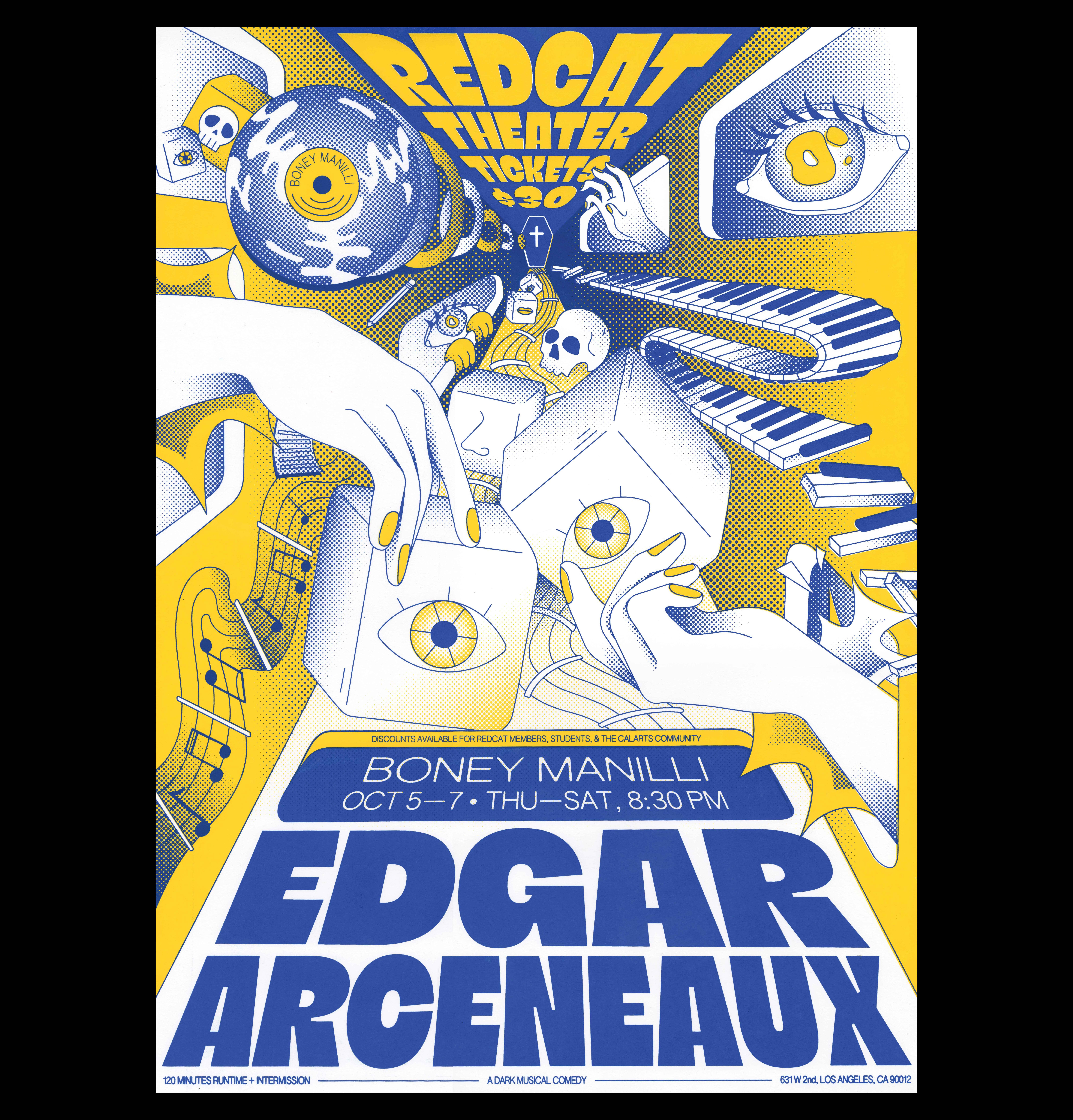
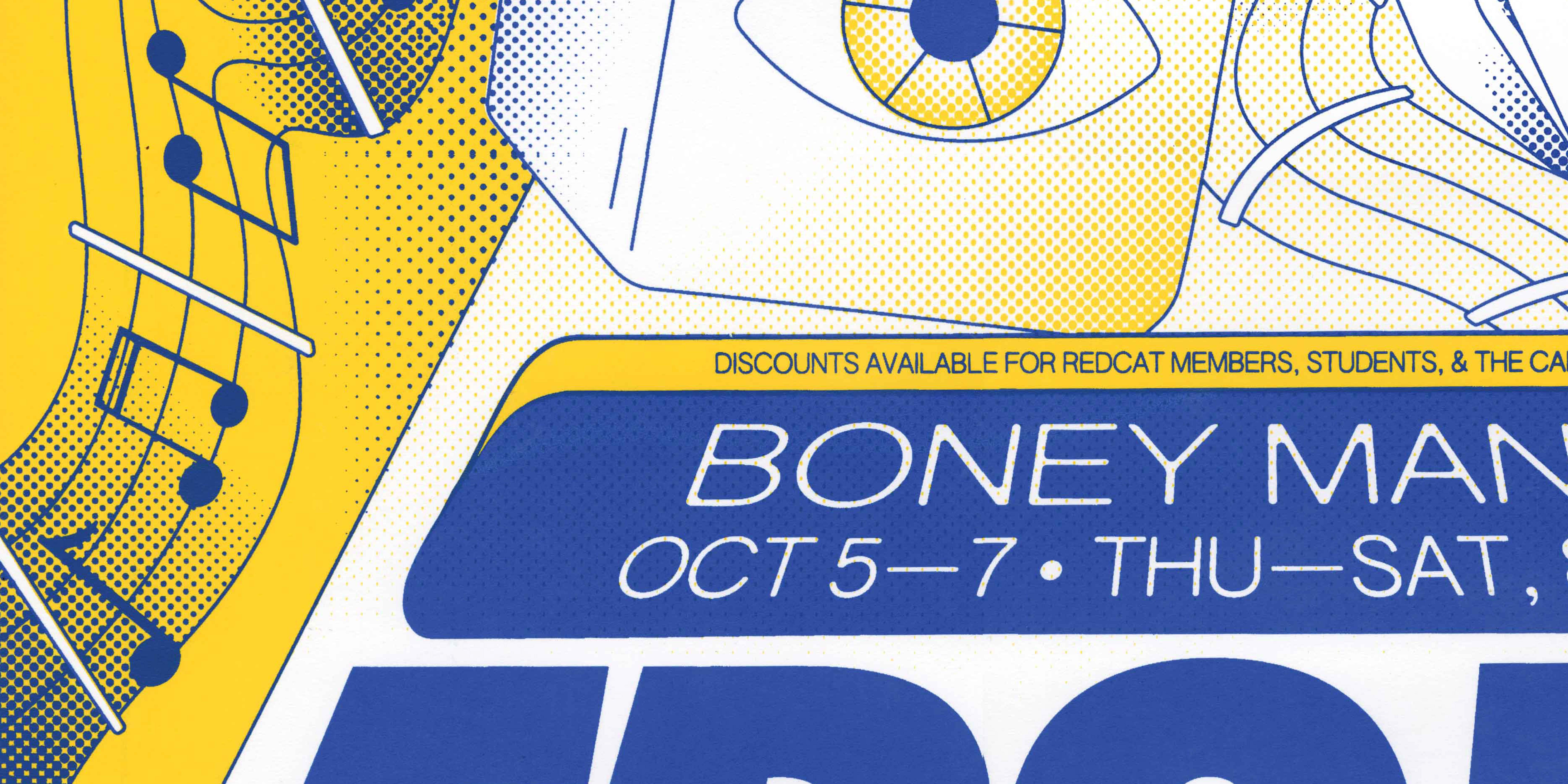
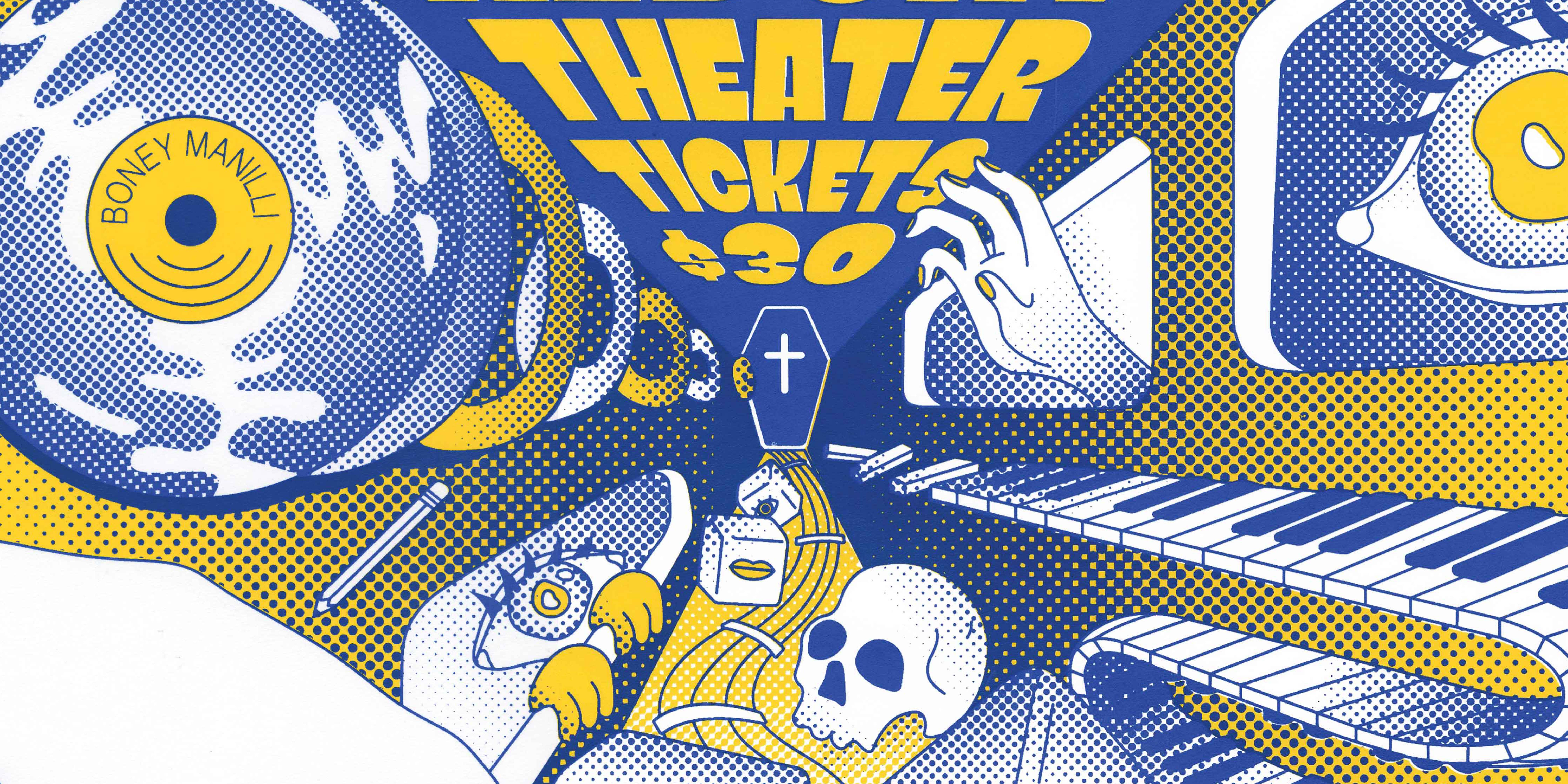
Designed in collaboration with Ally Sutton, this 20x28 inch screenprinted poster was created for a show at REDCAT Theater in Los Angeles. Illustrated entirely by us, the two-color design draws from the layered, conceptual nature of Edgar Arceneaux’s work.
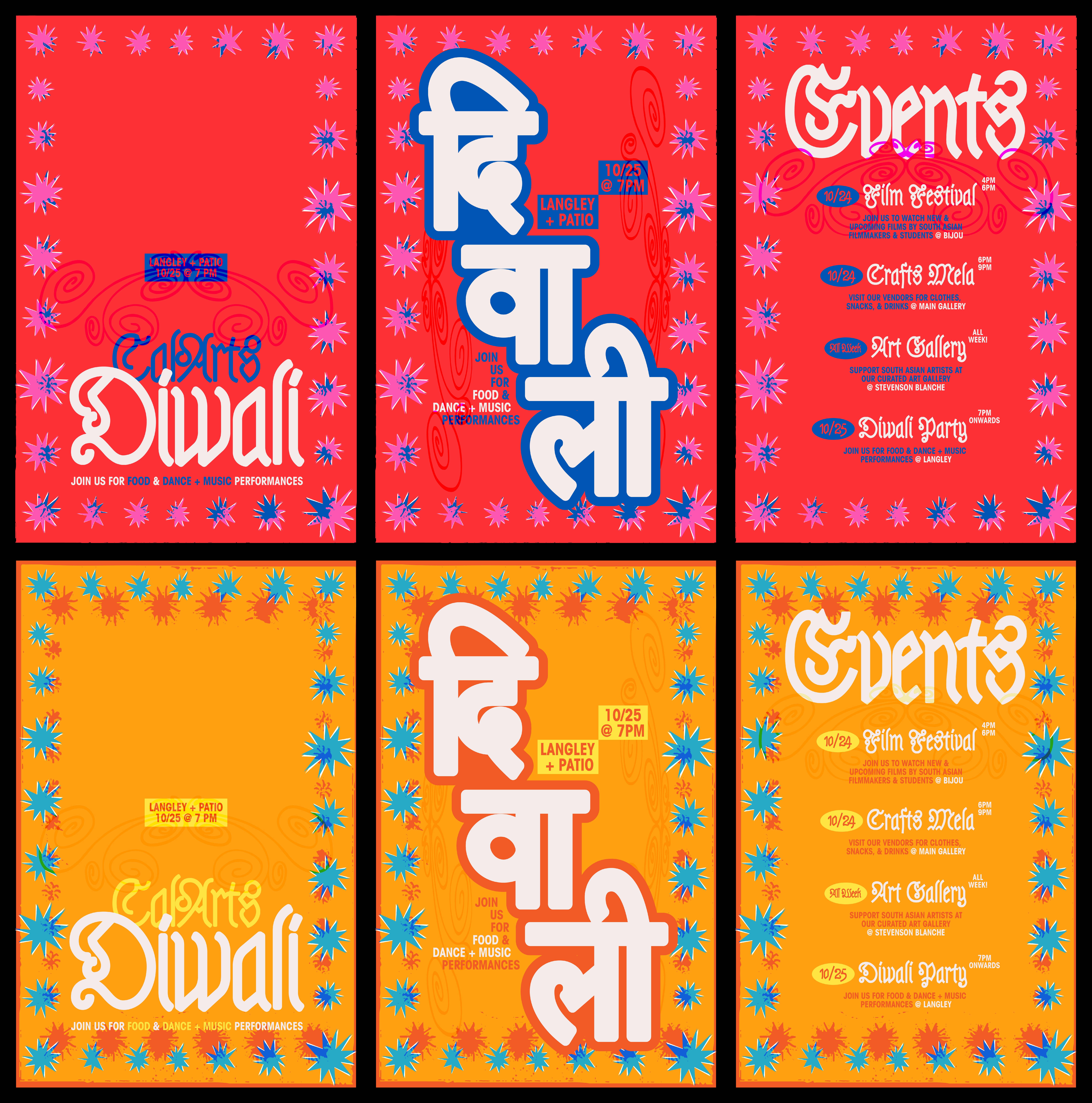
CalArts Diwali
A series of 11x17 posters designed for CalArts’ Diwali celebrations, highlighting different events happening across campus.
Designed in two colorways and set in both Latin and Devanagari scripts, the series played with the visual rhythm and harmony between languages while celebrating cultural multiplicity.