Blockbuster
A 144-page hand-sewn publication with a double-sided, screen-printed cover in two colorways. Blockbuster archives Bollywood posters and title cards, exploring visual trends, typographic instinct, and the evolution of South Asian graphic design.
I looked at over a hundred posters, most of which I had never studied formally, despite having grown up around them. This project was a way of returning to those visuals with fresh eyes—not just as a designer, but as someone trying to make sense of their own instincts.
I started to notice patterns, moves I had made before in my own work, and began to trace a lineage between what I grew up seeing and what I now make.
This collection is a small piece of a larger thesis about memory and influence. It reminded me that paying attention—to what feels intuitive, to the past, to what often gets overlooked—is one of the most valuable tools I have as a designer.
Grass Between The Stones
A double-sided map of my hometown, Chandigarh—India’s first modern city, designed by Le Corbusier after Partition. The project explores the tension between its low-context, modernist planning and the high-context culture of the people who live there.
This was a deeply personal piece. I spent a lot of time researching the political history, architecture, and planning principles that shaped the city—but what made it most meaningful was speaking with my parents, who were both born and raised there.
Chandigarh is a relatively young city, almost the same age as my parents, and their stories revealed how the city has grown and shifted over time, beyond its original utopian ideals.
At some point, the project turned into a bit of a rant about a chair—designed for Chandigarh, later auctioned off in the West for thousands, completely removed from its context and sold back as a luxury object. One section of the map is devoted entirely to that story, as a reflection on erasure and appropriation.
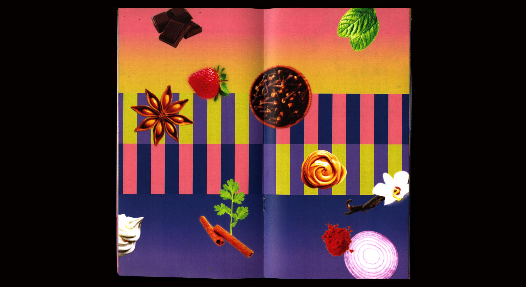
Emotional Eating
A collaborative zine with Kari Trail exploring reader interaction. Depending on the direction you read the zine, discover two different (emotional) recipes.
Inspired by vintage Indian catalogs and bright bold colorways, the recipe guide also plays with readability, book interactivity, and fun pairings between Hindi and English typefaces.
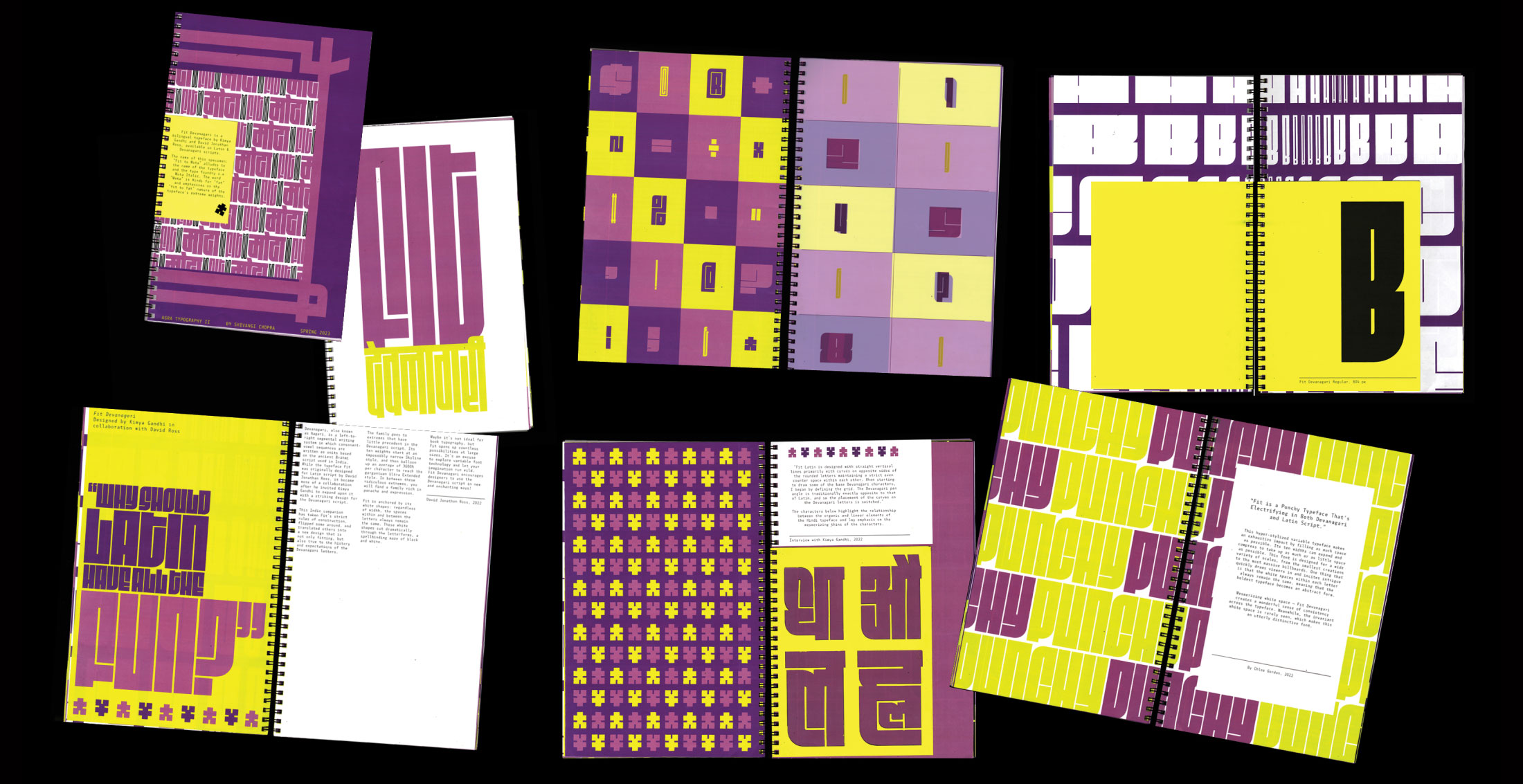
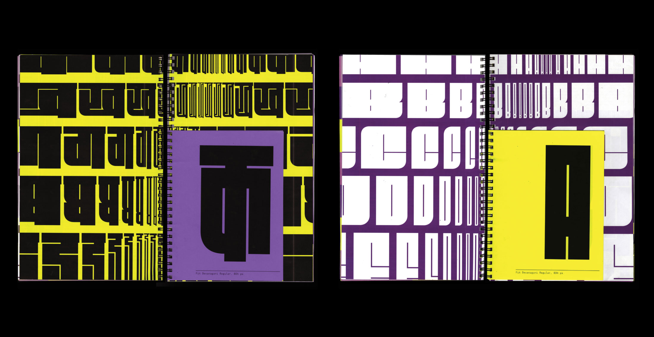
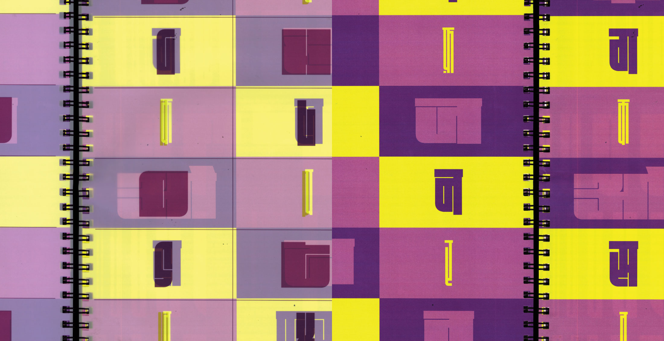
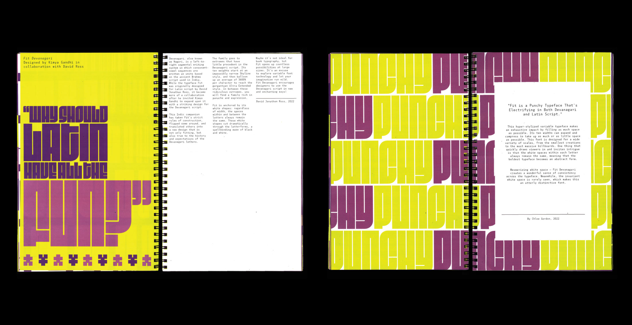
Fit To Mota
A 20-page handmade type specimen celebrating Fit Devanagari by Kimya Gandhi and David Jonathan Ross. This project explores the extreme weights of the typeface, designed to “fit” seamlessly into any space.
Through type cascades, tactile materials, mini-pages, and other experimental layouts, the specimen bridges connections between Devanagari and Latin scripts. Wrapped in a spiral-bound format, it features a dust cover twhat unfolds into a massive poster—blurring the lines between book and display piece.
Root Cause
A short, satirical zine exploring decay—drawing tongue-in-cheek parallels between mental burnout and the withering basil on my balcony.
Sized at an unusually tall and narrow 3x9 inches, the format mirrors the strange and slightly offbeat premise.