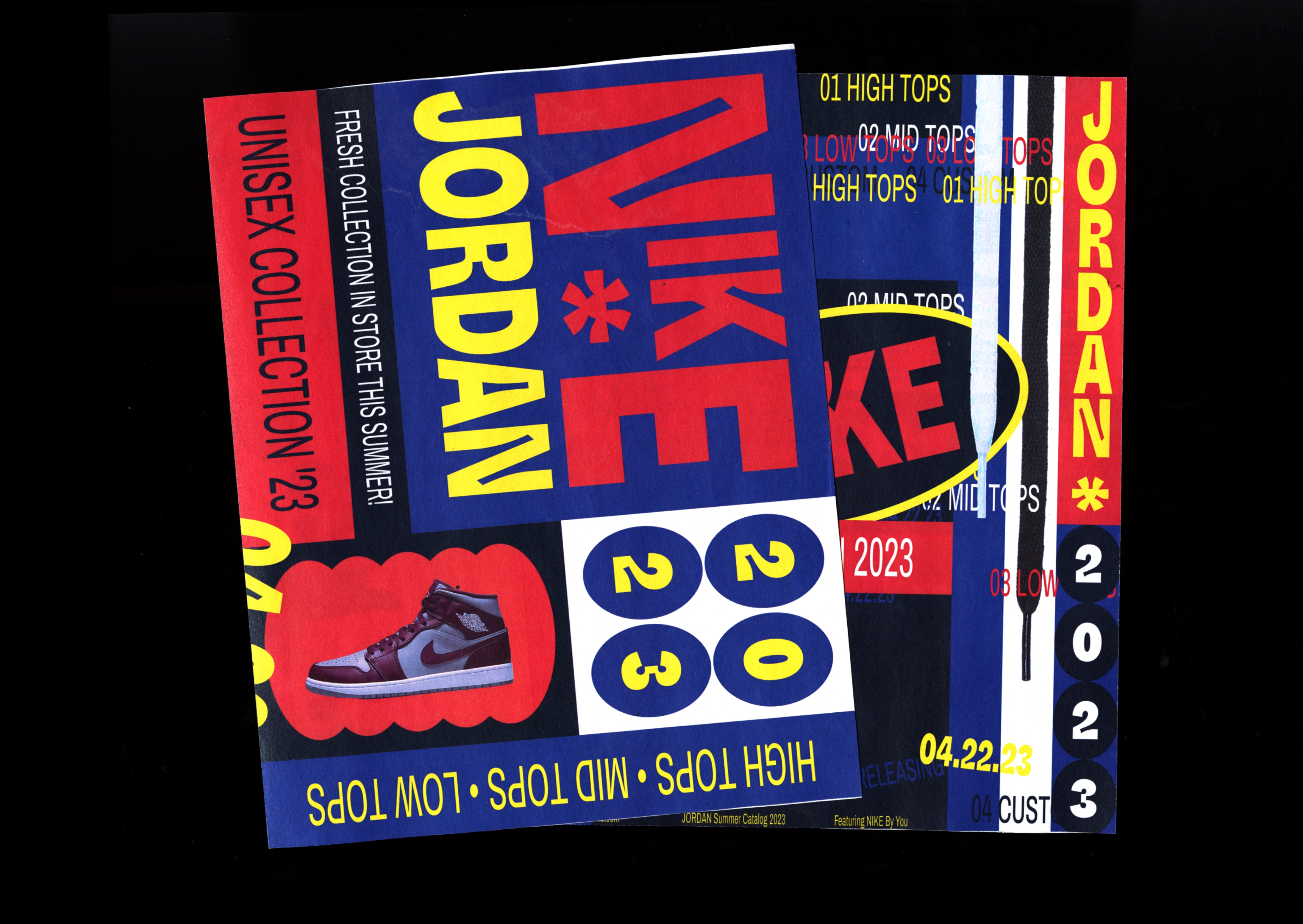
JORDAN CATALOG REDESIGN
IDENTITY / PRINT / WEB
Rebranding Nike through a print catalog and website walk-through for Jordan
A mock rebranding project for Nike Jordan in the form of a print and digital catalog, specific to the Jordan shoes collection. The aim of this project is to combine and explore physical and digital design-scapes.
The rebrand is focused on capturing the essence of a 50s newspaper ad through shapes and color. The print form of the catalog is designed to be a freebie catalog that includes a double-sided Jordan poster along with the product spreads. Printed on newsprint, the physical catalog combines contemporary typography to give the rebrand a modern feel.
The website walk-through showcases a more functional and more subtly inspired version of the print, using motion elements merged with the same color scheme and typography.
︎︎︎ 2023
︎︎︎ Adobe InDesign, Adobe Photoshop, Adobe Illustrator, Adobe After Effects
︎︎︎ California Institute of the Arts


